UX Case Study: NIFT Kangra Campus Map Design

Project Overview
Navigating a complex campus like NIFT Kangra requires an intuitive and structured wayfinding system that ensures ease of movement for students, faculty, and visitors. This project follows the Design Thinking process popularised by Stanford d.school, ensuring a user-centric approach through an iterative process including research, prototyping, and testing. This project focused on designing a clear and efficient campus navigation system by leveraging insights from user research, schematic mapping principles, and cognitive wayfinding models. The solution includes a multi-floor navigation system, colour-coded zoning for better differentiation, and an optimised legend for quick reference. By integrating these elements, we developed a print-ready wayfinding system that enhances spatial awareness, improves navigation efficiency, and creates a seamless campus experience.
EMPATHISE
Who is our user, and what challenges do they face?
To design an effective campus map, we needed to first understand our users students, faculty, visitors, and staff. What confuses them? Where do they struggle the most?
Key Findings from User Research:
New students often get lost trying to locate specific buildings, especially during the first few weeks.
Users relied heavily on landmarks rather than formal signage.
Multi-floor buildings made it difficult for people to locate specific laboratory and classrooms.
A colour-coded system was needed to distinguish different zones effectively.
How did we gather these insights?
User Interviews: Conducted with students, faculty, and visitors.
Shadowing Users: Observed how new students navigated the campus.
Surveys: Collected feedback on existing campus maps and wayfinding challenges.
Competitor Analysis: Studied campus maps from leading universities to understand best practices. For example Campus map of IIT Bombay
Faculty: Aredath Siddharth, Deep Shikha Walia
Students: Anshul Negi, Nandini Shree
DEFINE
What do our users need?
Through our research, we defined key user needs:
Clear and accessible routes for all the users.
A visually intuitive map that simplifies navigation for first-time visitors.
Landmark-based navigation to make orientation easier.
Tools Used to Identify the Core Problem:
Affinity Diagramming – Categorised navigation challenges into common themes.
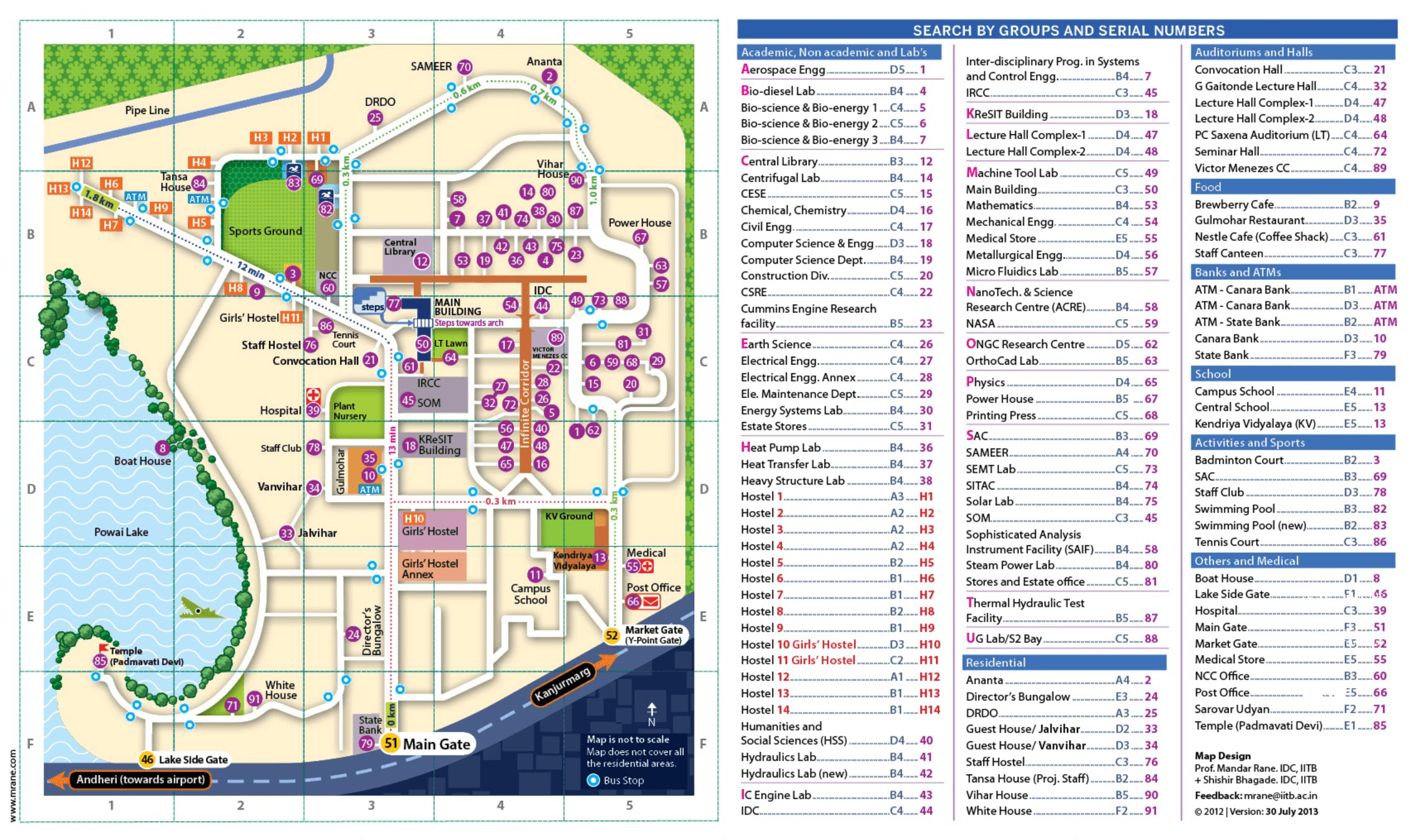
Fig. 1. Analysing IIT Bombay Campus map.
Wayfinding Challenges
Multi-Floor Navigation
Zoning & Section Identification
Accessibility & Readability
Journey Mapping – Traced user movement across campus to highlight problem areas. Users were confused especially freshers as they were not able to identify the academic blocks.
User Interviews – Conducted structured interviews with students and staff to gather qualitative insights on navigation difficulties.
Users relied heavily on landmarks rather than signage.
Difficulty in identifying entry and exit points.
Confusion in
multi-floor navigation due to insufficient differentiation.
The previous map lacked floor-wise differentiation, making multi-level navigation difficult.
Users struggled to locate rooms and labs on different floors.
Staircases were not clearly marked.
Academic, residential, and administrative areas were not visually distinguished.
Users had trouble identifying key facilities like the mess, parking, and hostels.
Administrative areas were not prominent enough despite their importance.
The previous map had inconsistent text sizes and cluttered labels.
Users found some colours difficult to distinguish.
The lack of high-contrast elements made quick scanning difficult.

Survey Analysis – Collected responses from a diverse set of campus users to quantify common pain points.
Hricha Kumari

3rd year student
“I mostly rely on familiar landmarks, like the canteen or the big tree near the A1 block. If I'm lost, I just ask someone.”
Problem Statement
NIFT Kangra lacked a structured wayfinding system, leading to frequent misdirection and navigation inefficiencies.
The absence of clear zoning indicators, floor-level differentiation, and a user-friendly legend made locating key areas difficult.
The existing campus map was unreliable, unclear, and visually unappealing, further complicating navigation for students, faculty, and visitors.
Ayushi Thakur
Visiting Faculty
"I expected proper signboards, but instead, I had to depend on students to direct me."
Debarshi Bhatta

M.Des student
“The old map was confusing and didn’t show all the floors properly. I did not find it relevant.”
Sayantan

M.Des student
“I always get confused between the different academic blocks like where blocks H and J are located.”
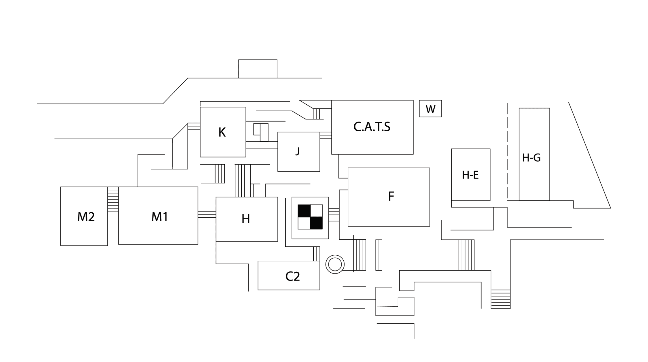
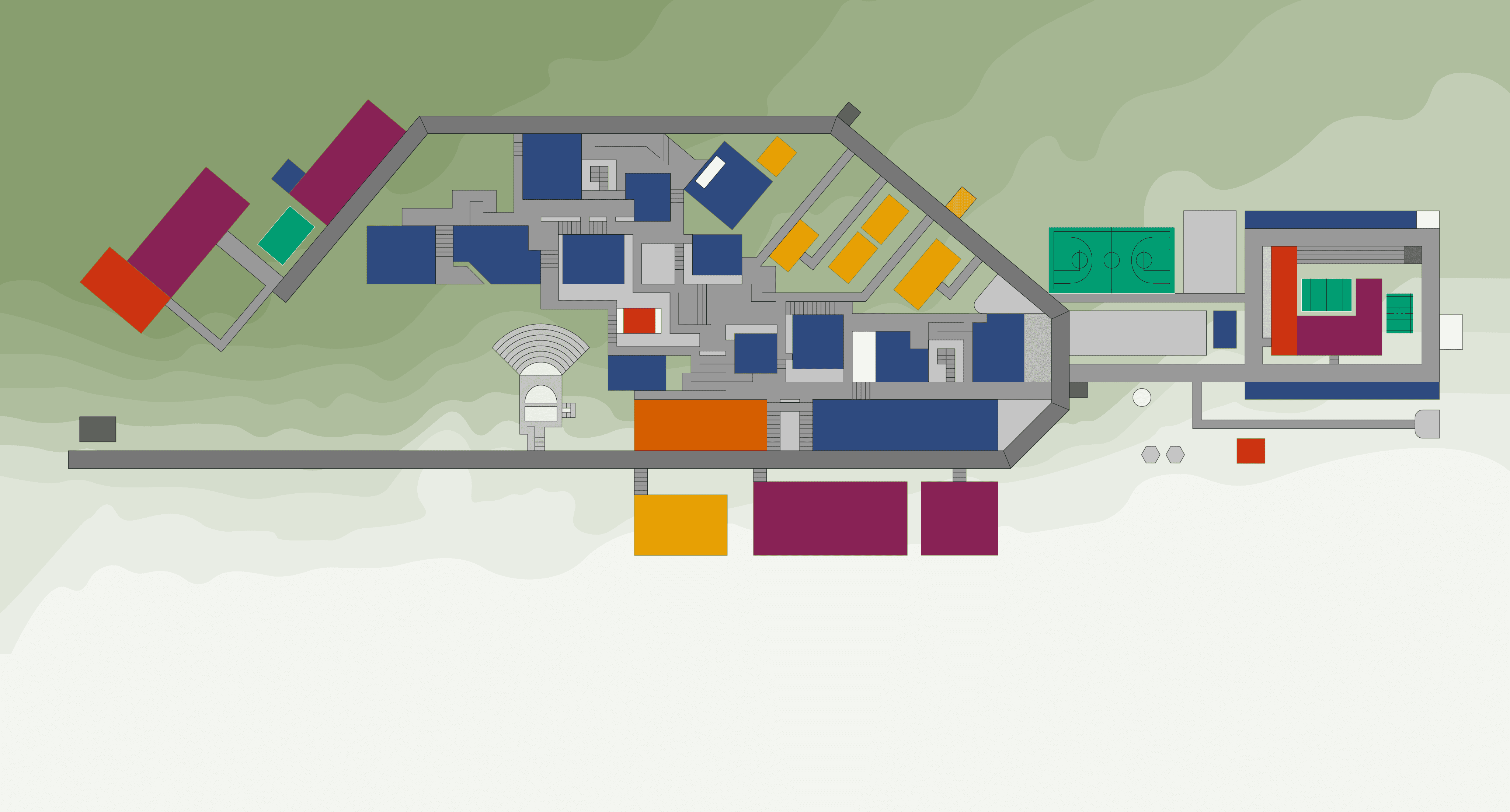
Reference Map
Zone 1
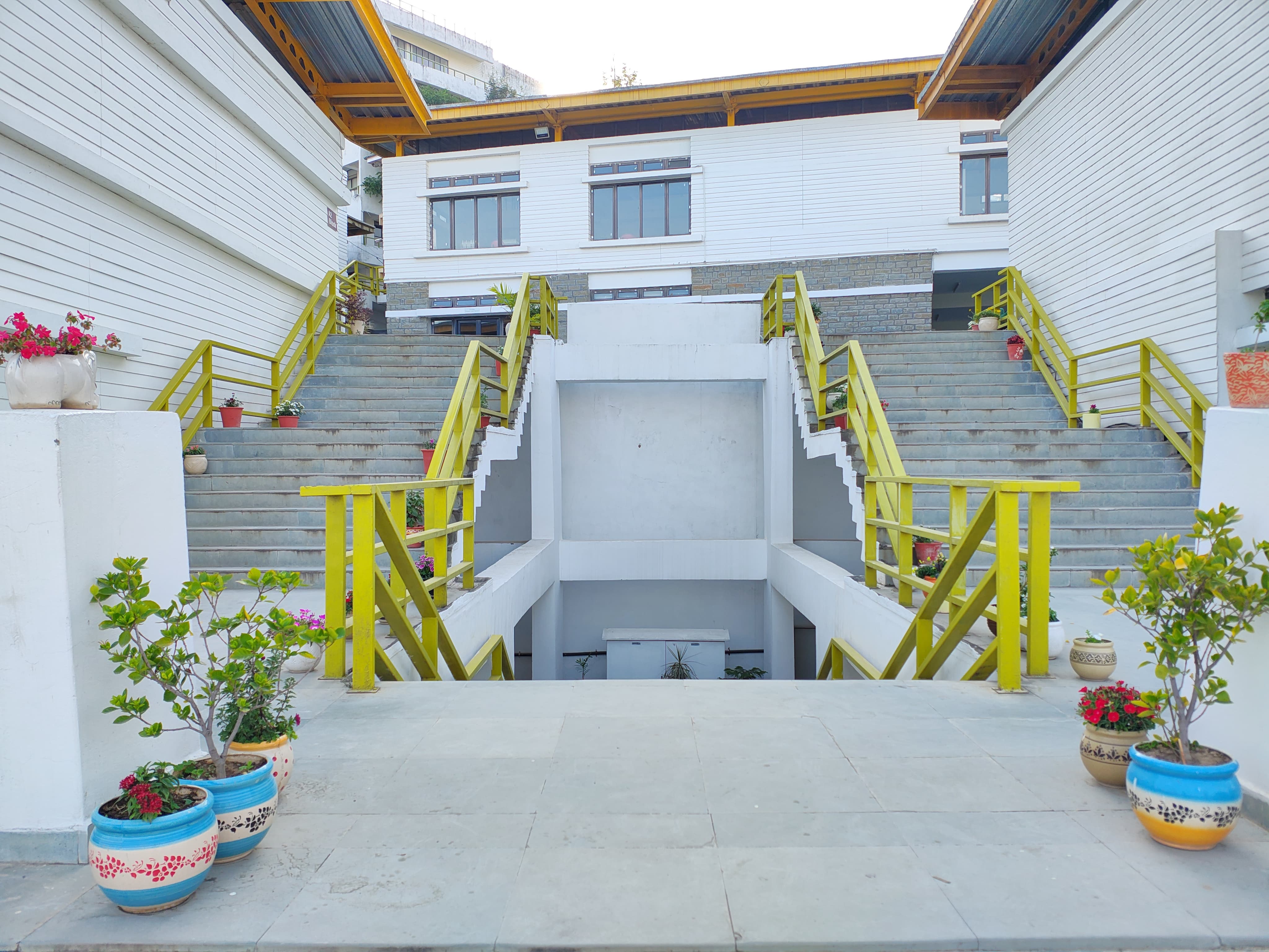
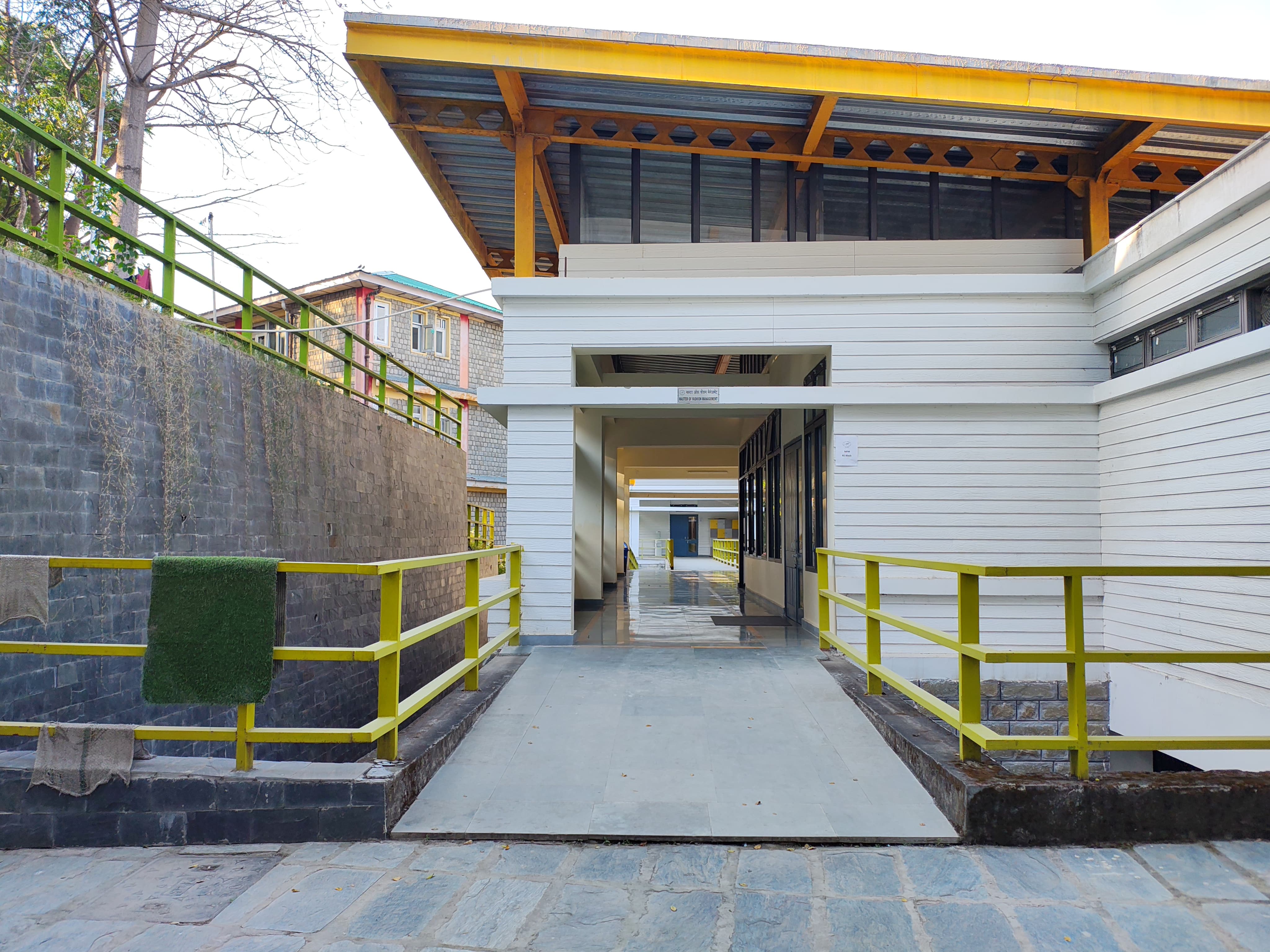
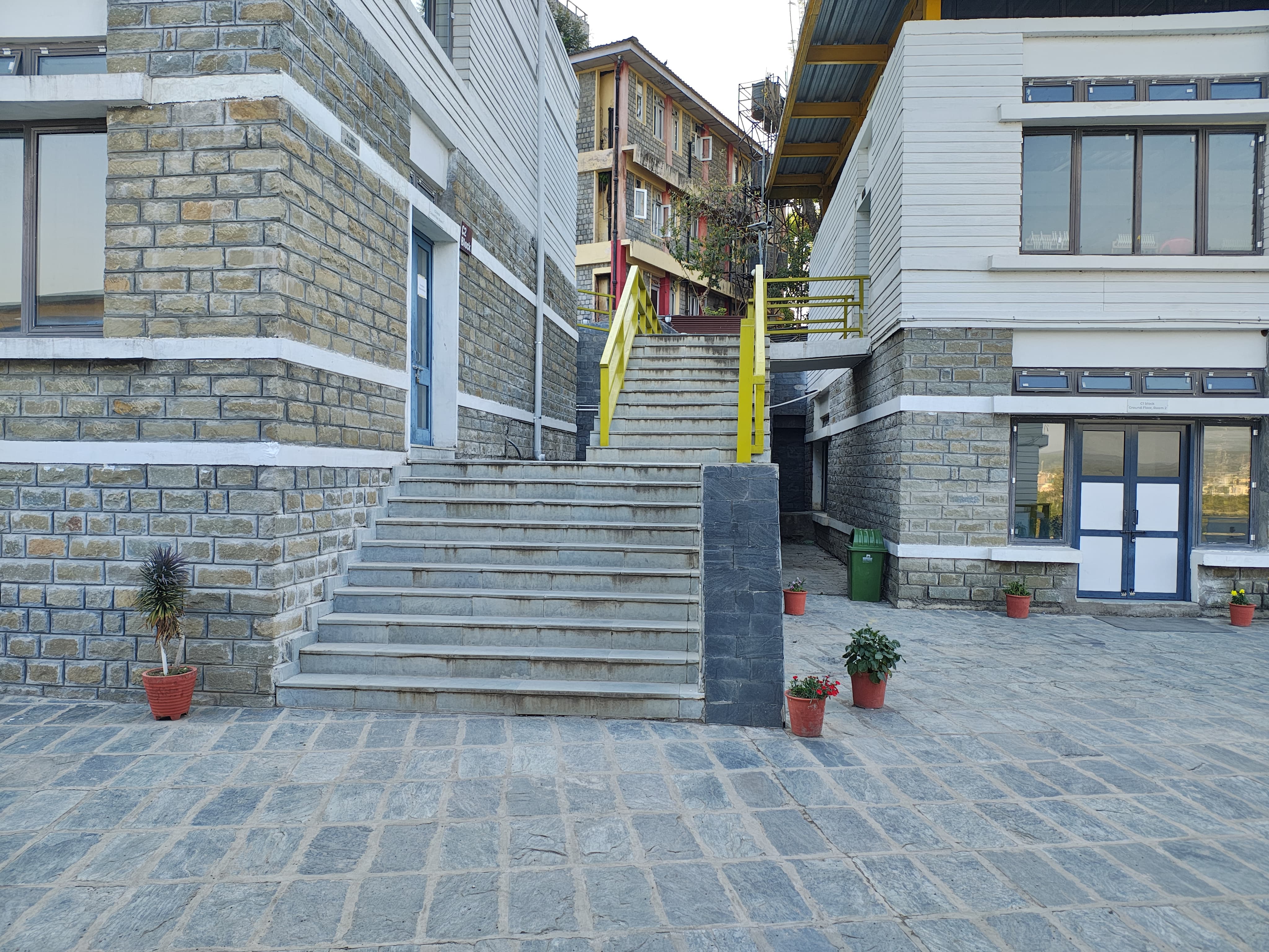
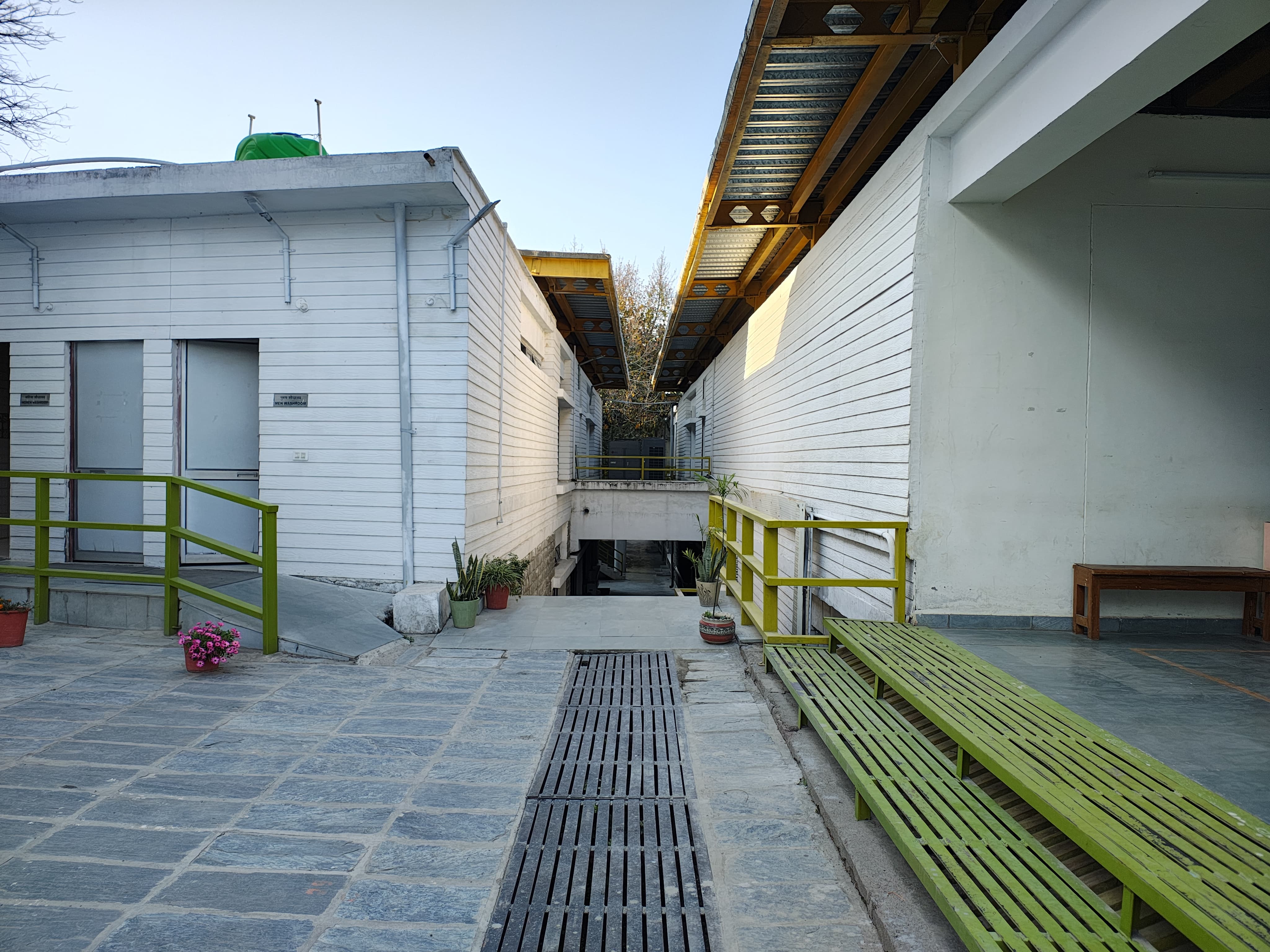
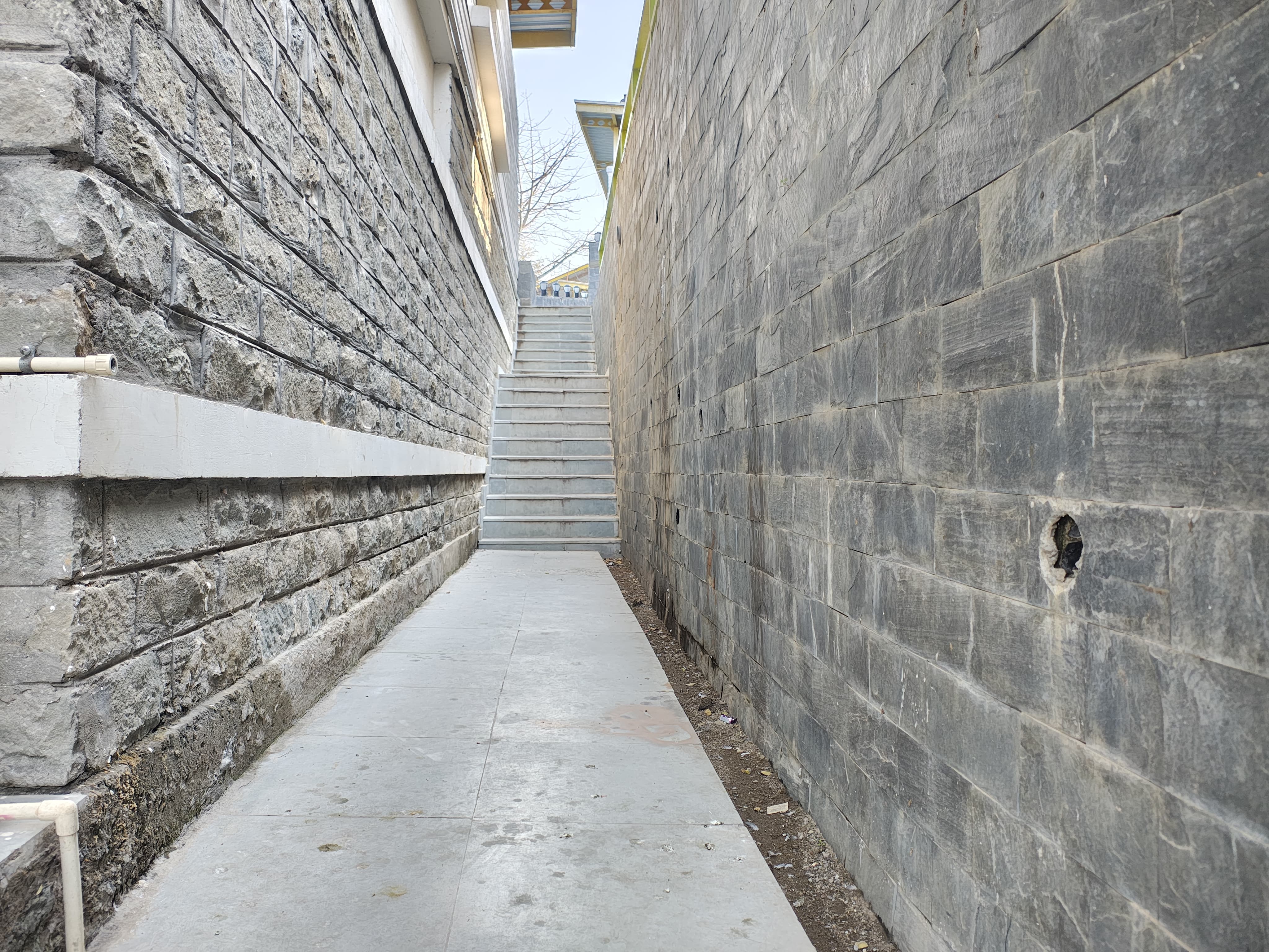
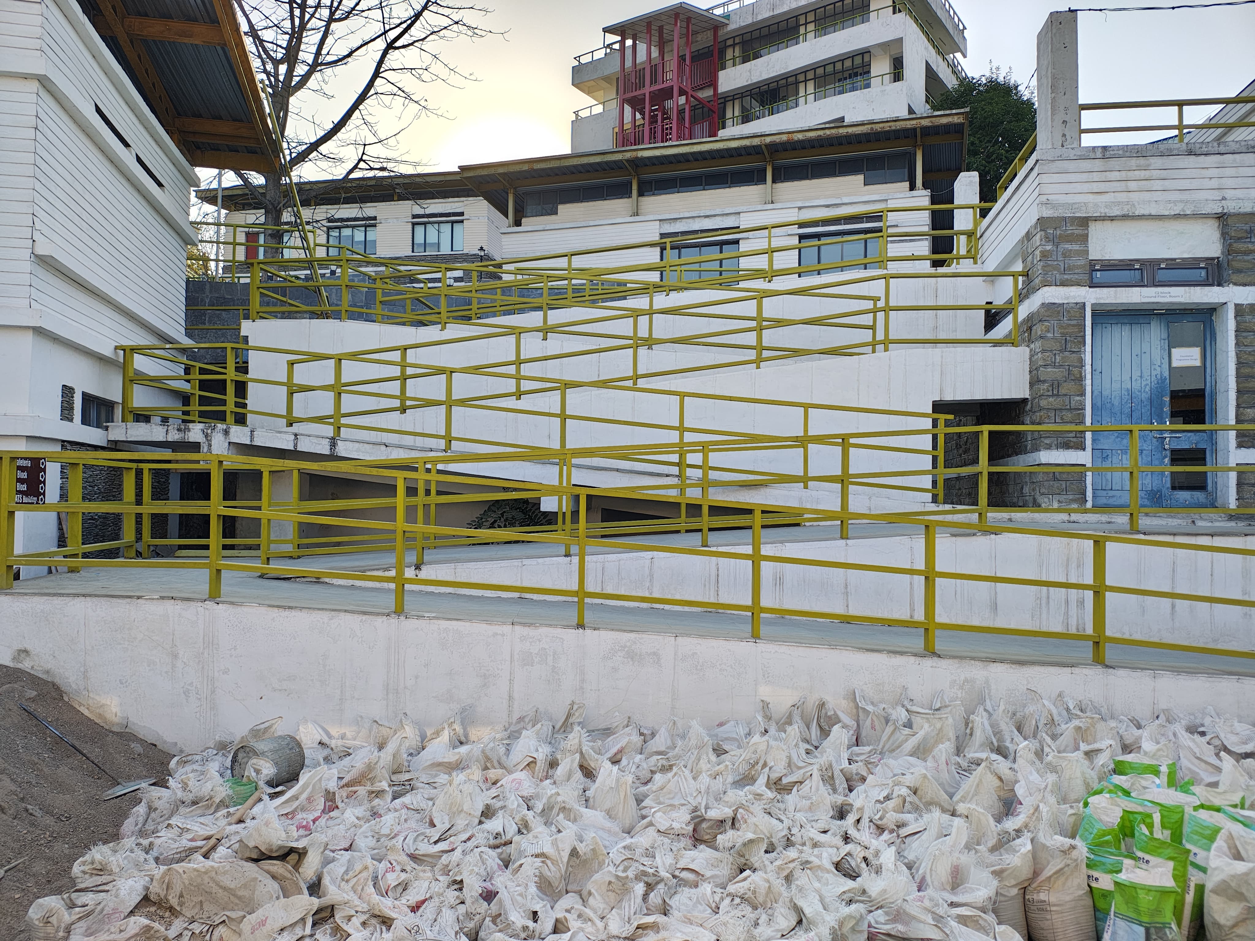
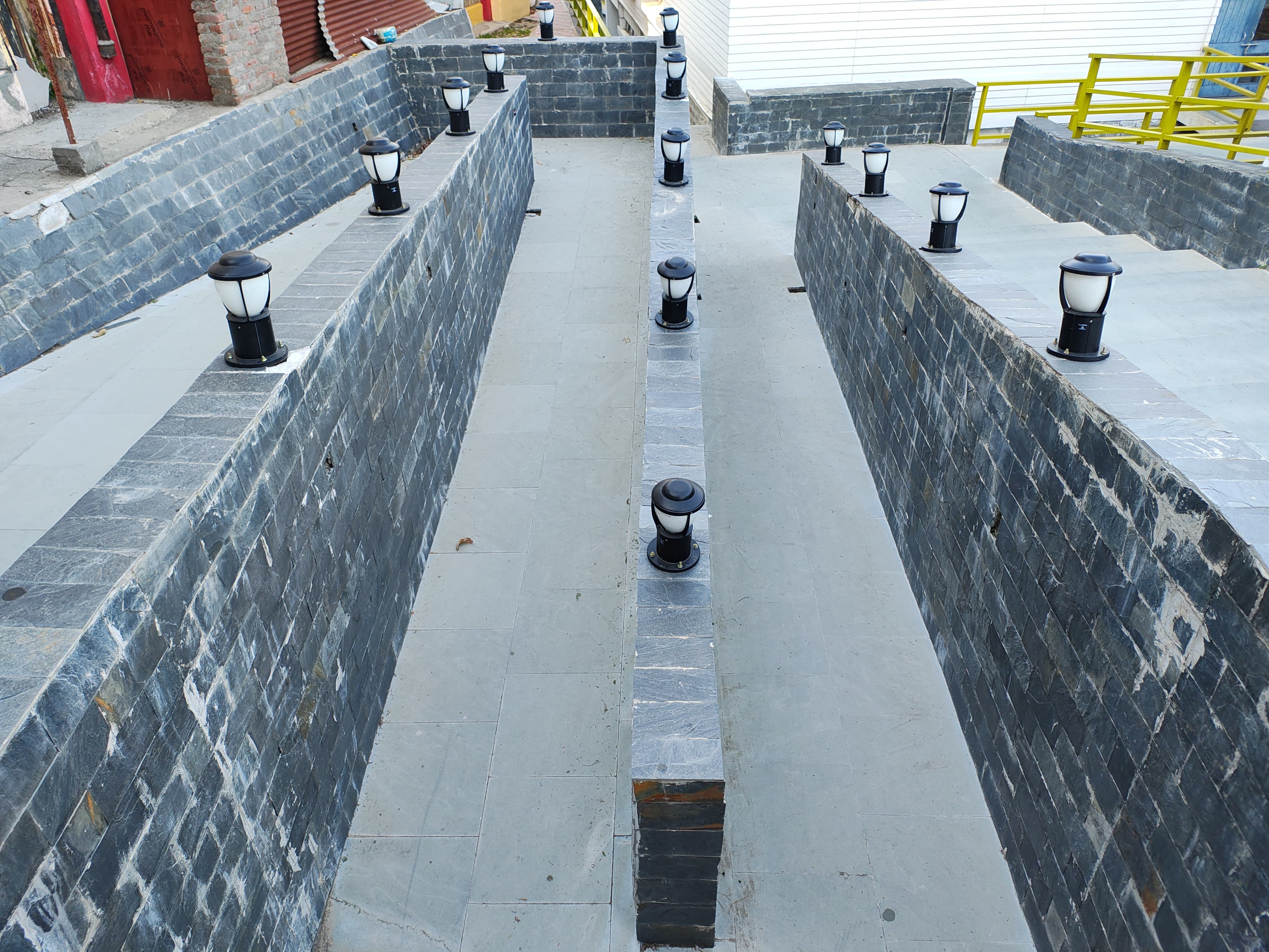
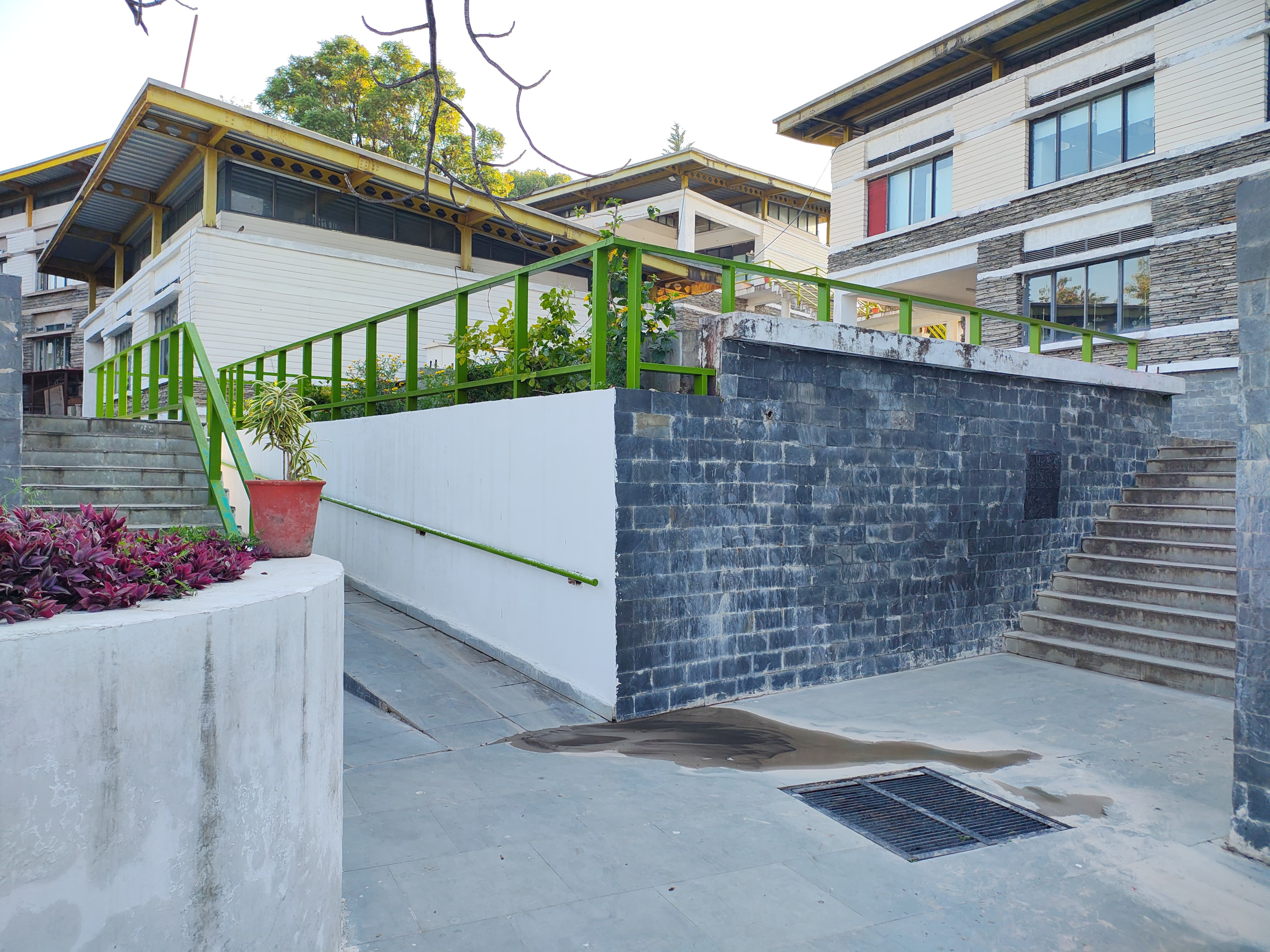
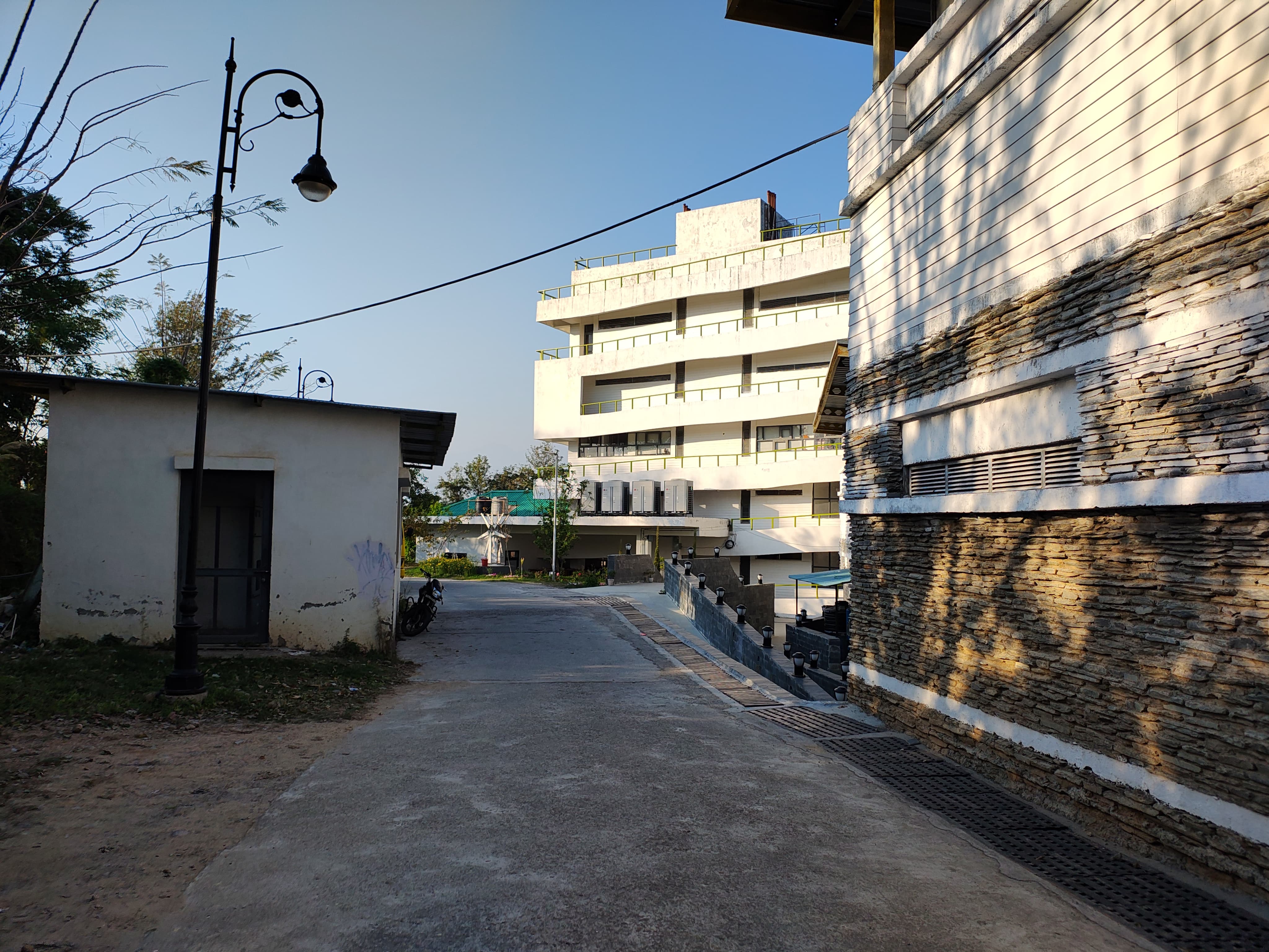
The previous map of NIFT Kangra was then used as inspiration to understand the positioning and shape of buildings,
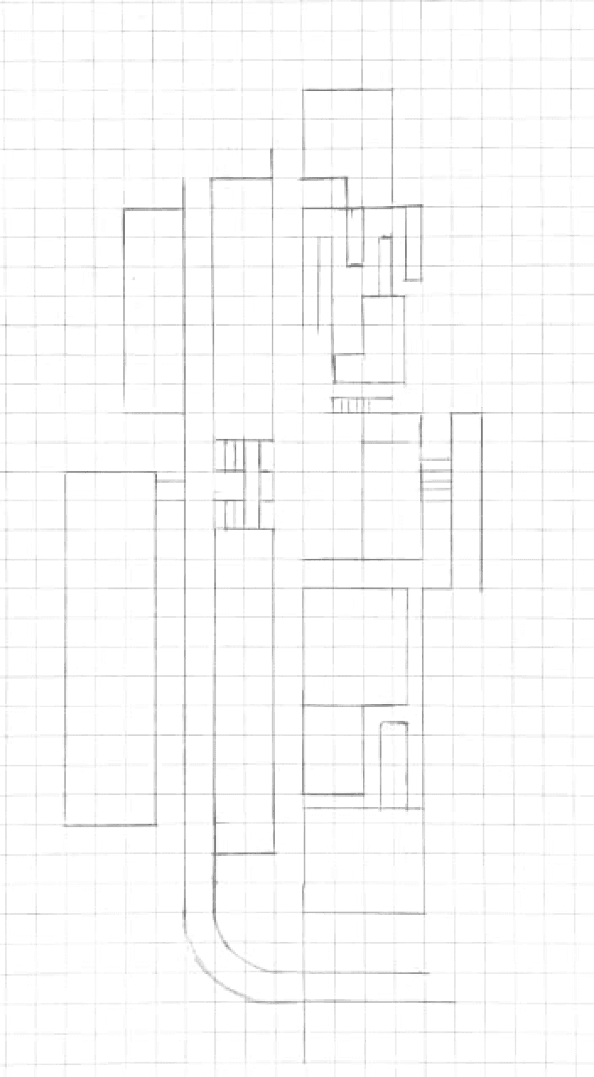
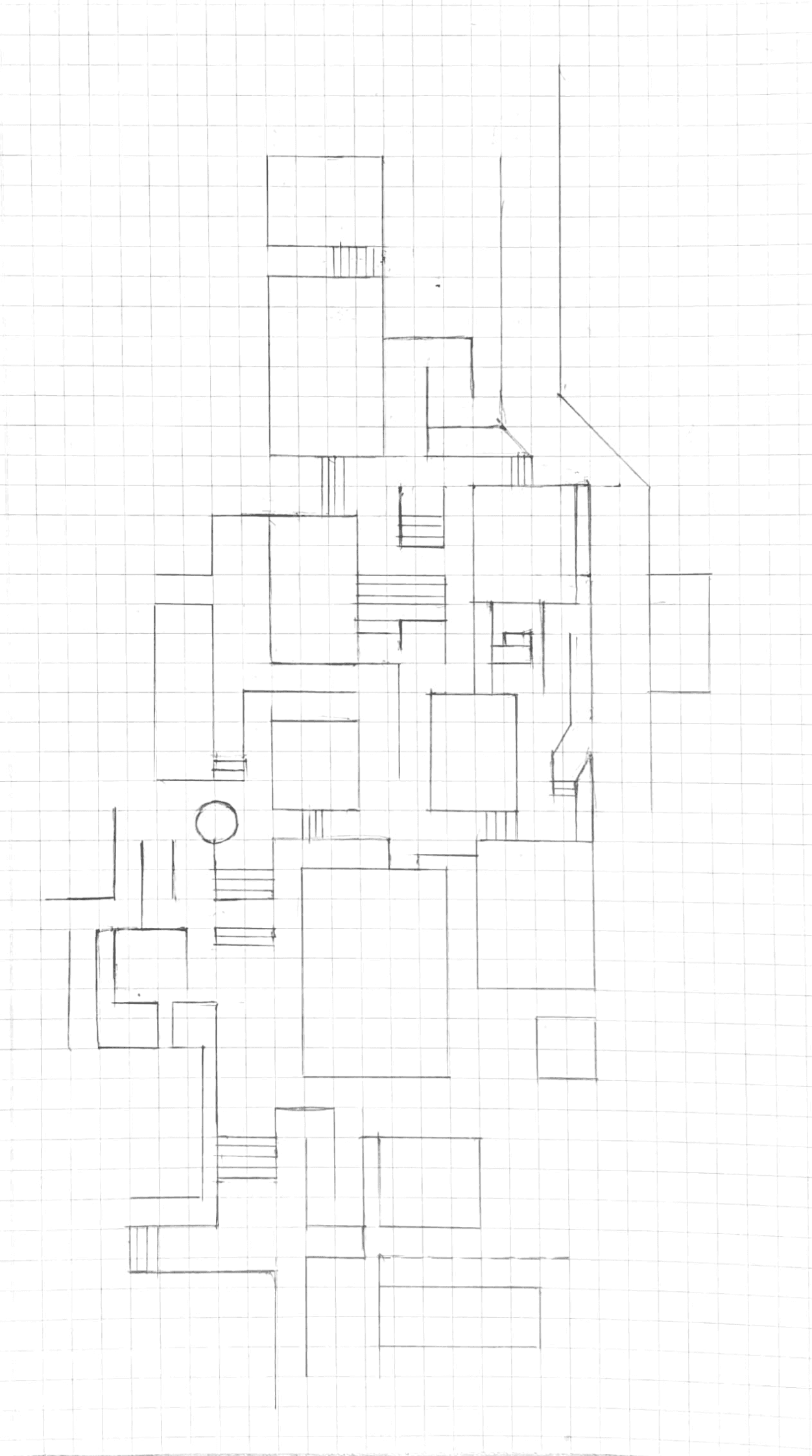
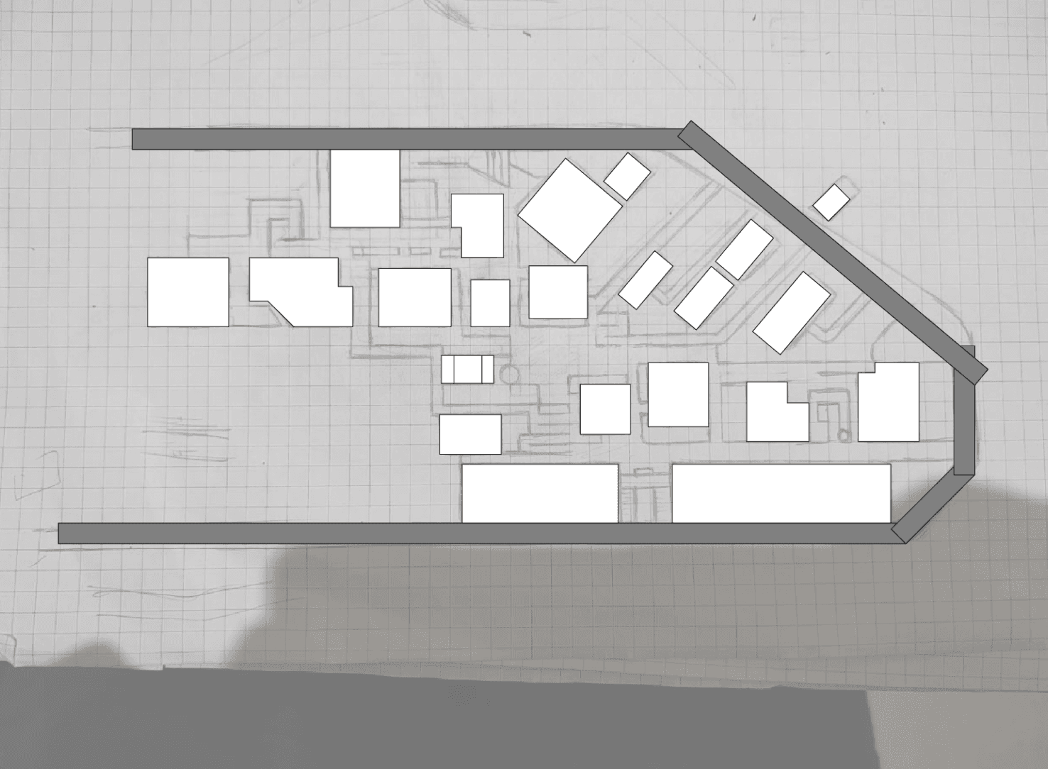
Next, the campus was divided into three zone - 1, 2, and 3. This is zone-1 Each area was sketched separately to understand the turns, paths, building distances, and identify staircases or clear walkways for accurate mapping.
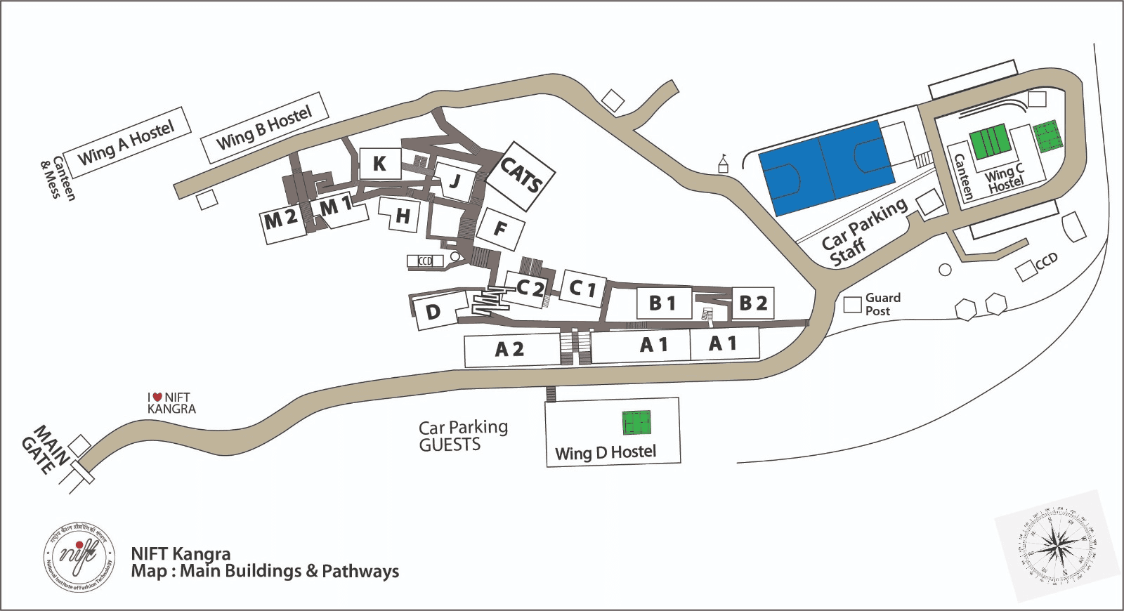
Divided the campus into three zones
A Guardian article on schematic map transformations: This helped us understand the distinction between schematic maps and geographically accurate ones.
Fig. 3. Photographs of Zone 1 sections for analysis and illustration.
Fig. 4. Sketch of Zone 1 on grids.
Fig. 5. Digital illustration of Zone 1.
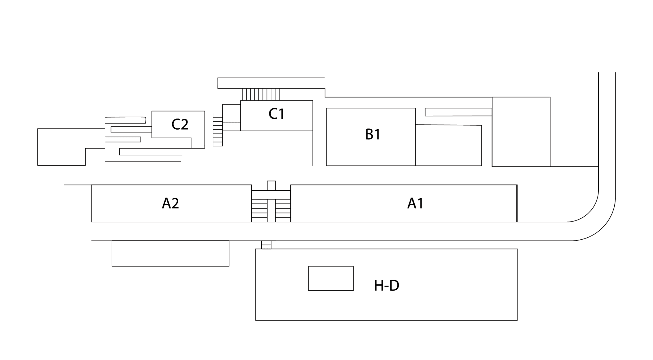
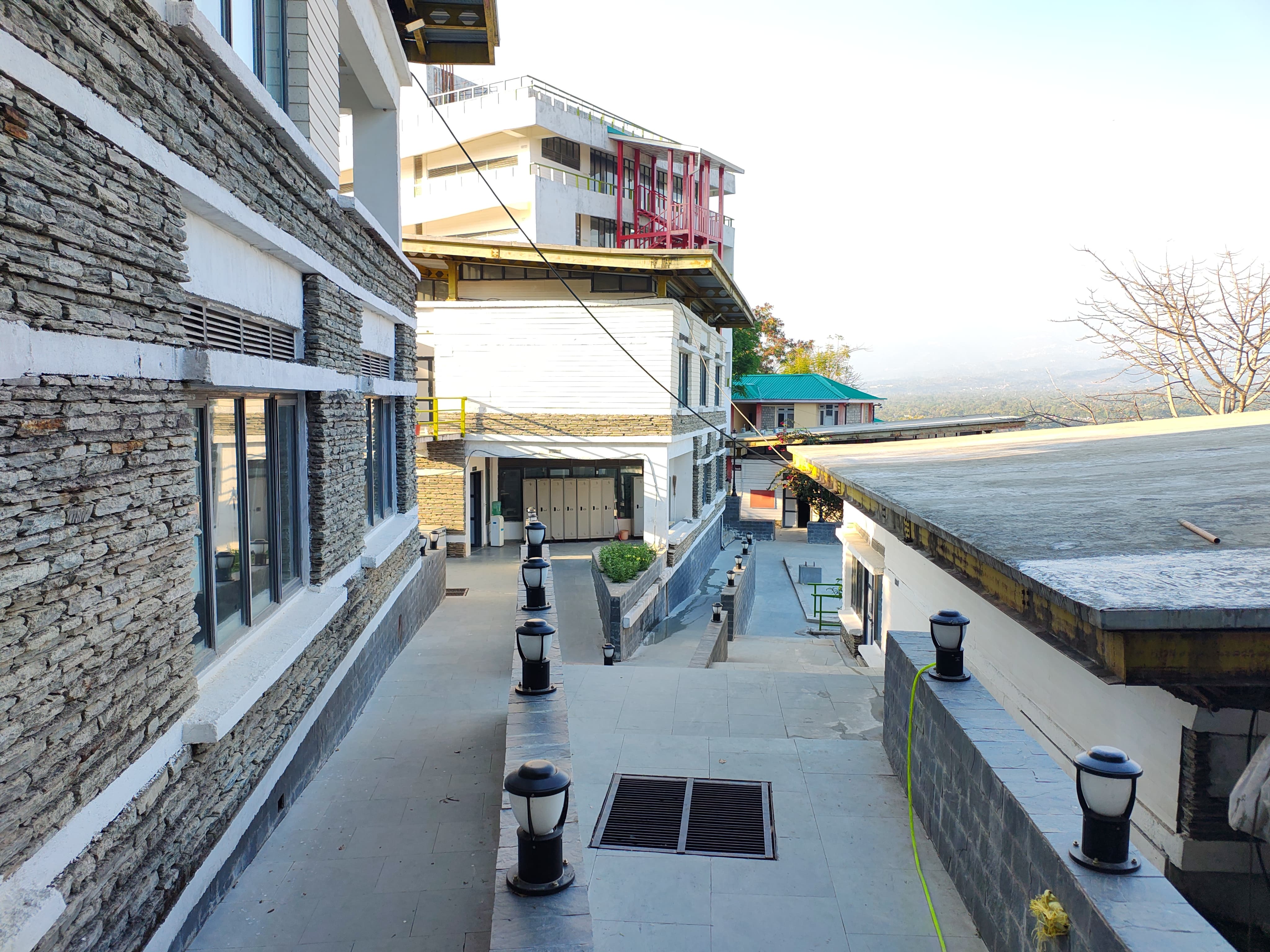
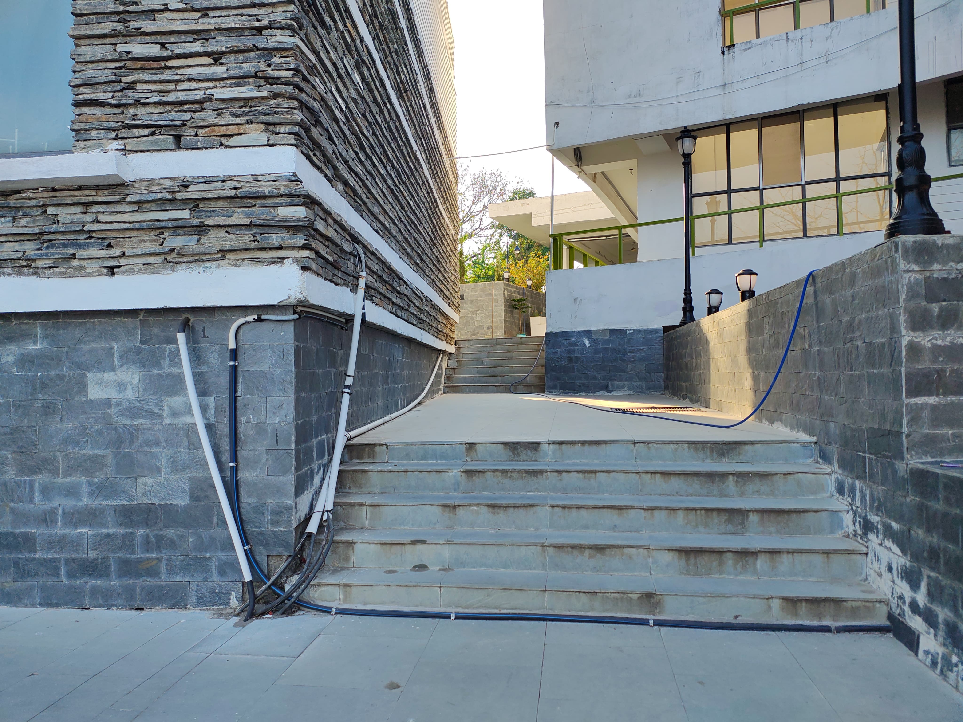
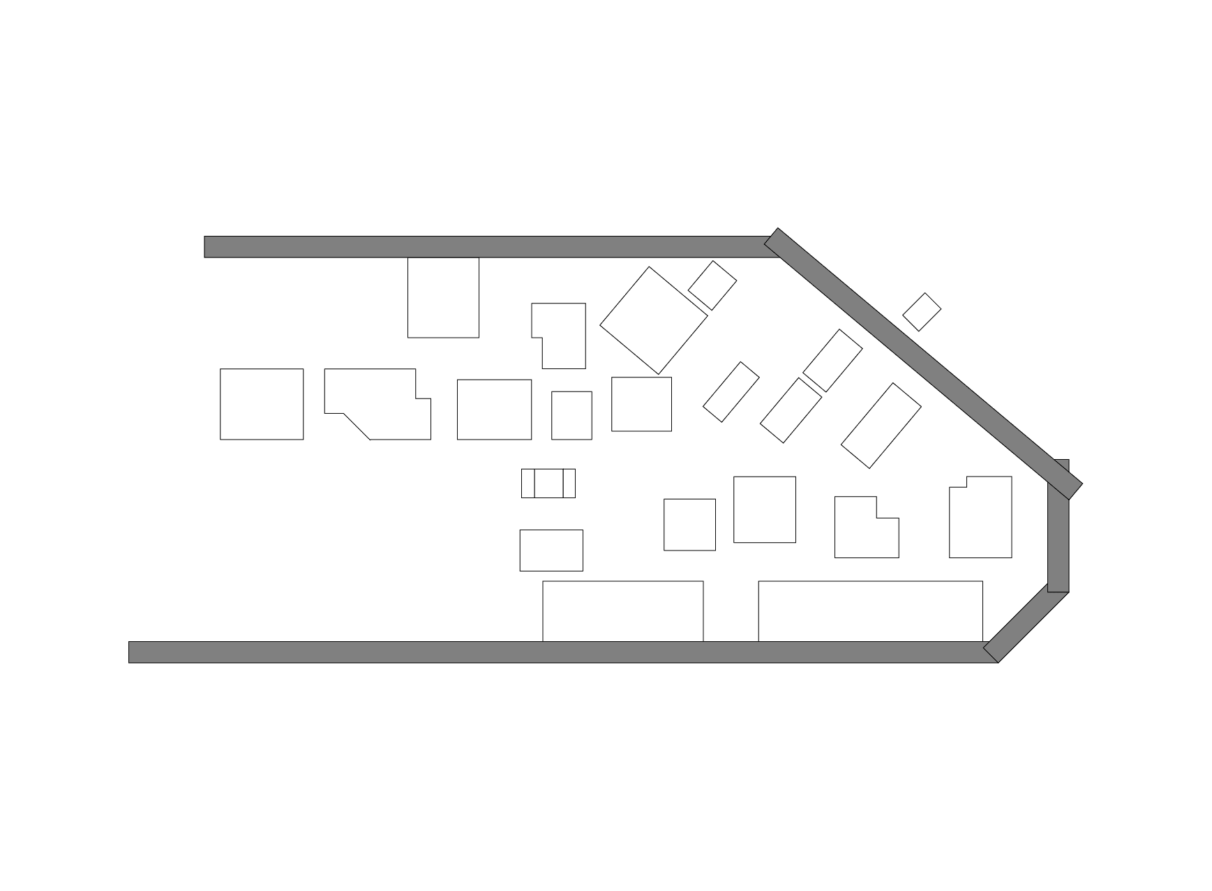
Zone 3
The third zone was further divided into two parts, as the paths and building shapes were already
well-structured, making it easier to map accurately.
Harry Beck's London Underground Map: This inspired our approach to utilising specific angles and schematic structuring.
Fig. 7. Sketch of Zone 2 on grids.
Fig. 8. Digital illustration of Zone 2.
Fig. 6. Photographs of Zone 2 sections for analysis and illustration.
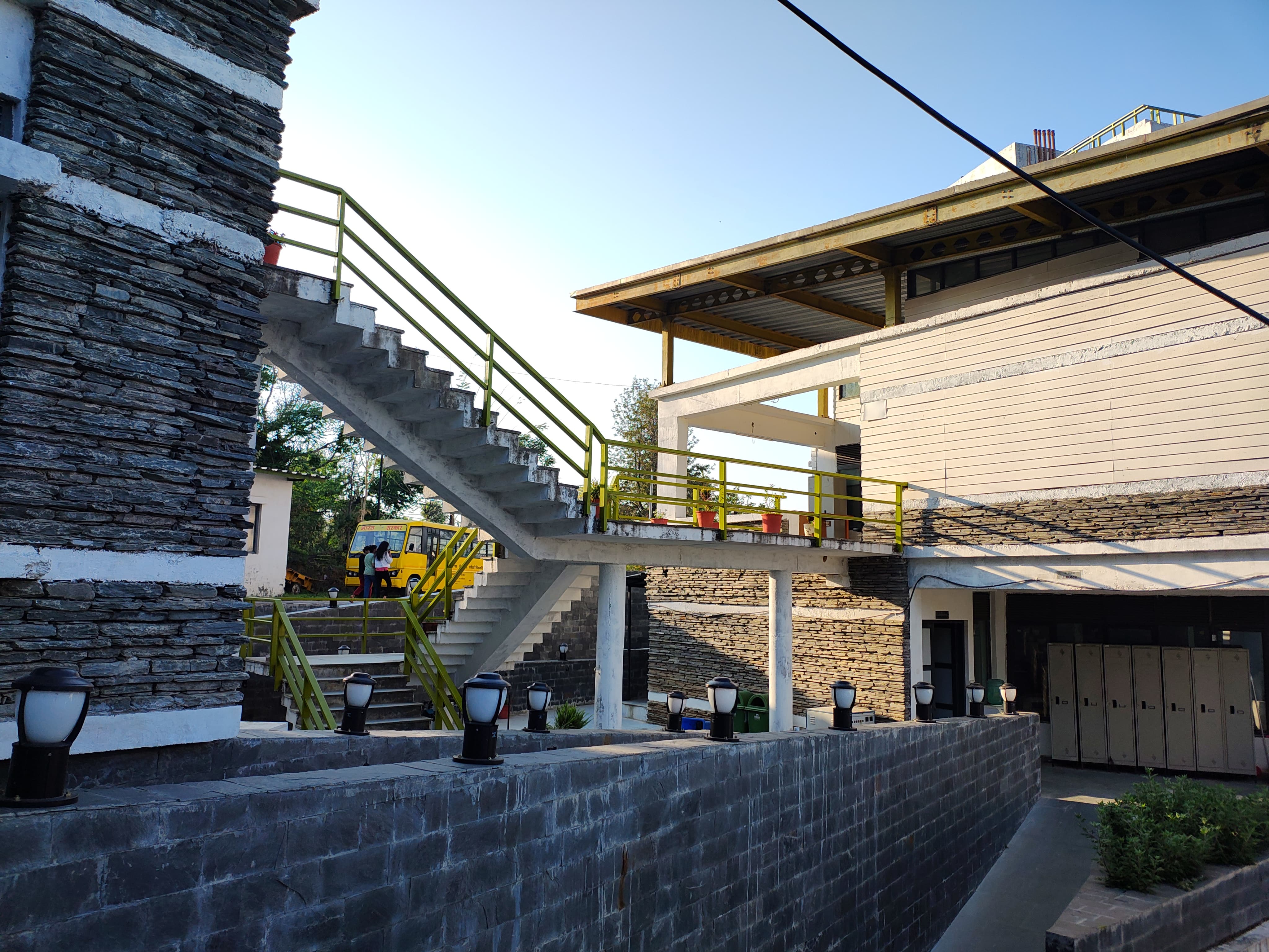
Zone 2
The second area was the most challenging to sketch due to its complex layout, angular paths, and lack of symmetry. Simplifying it was difficult and time-consuming, as figuring out the correct proportions and connections required extra effort.
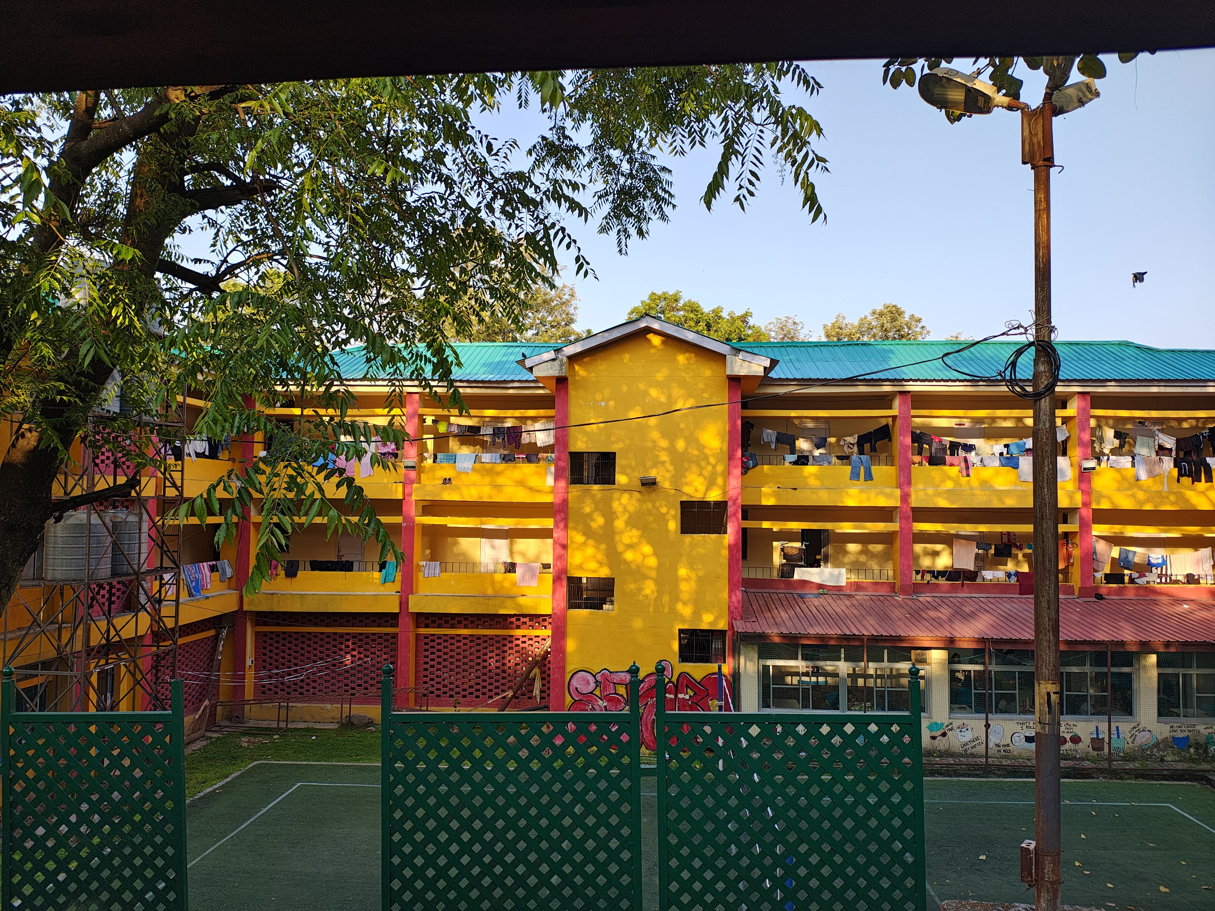
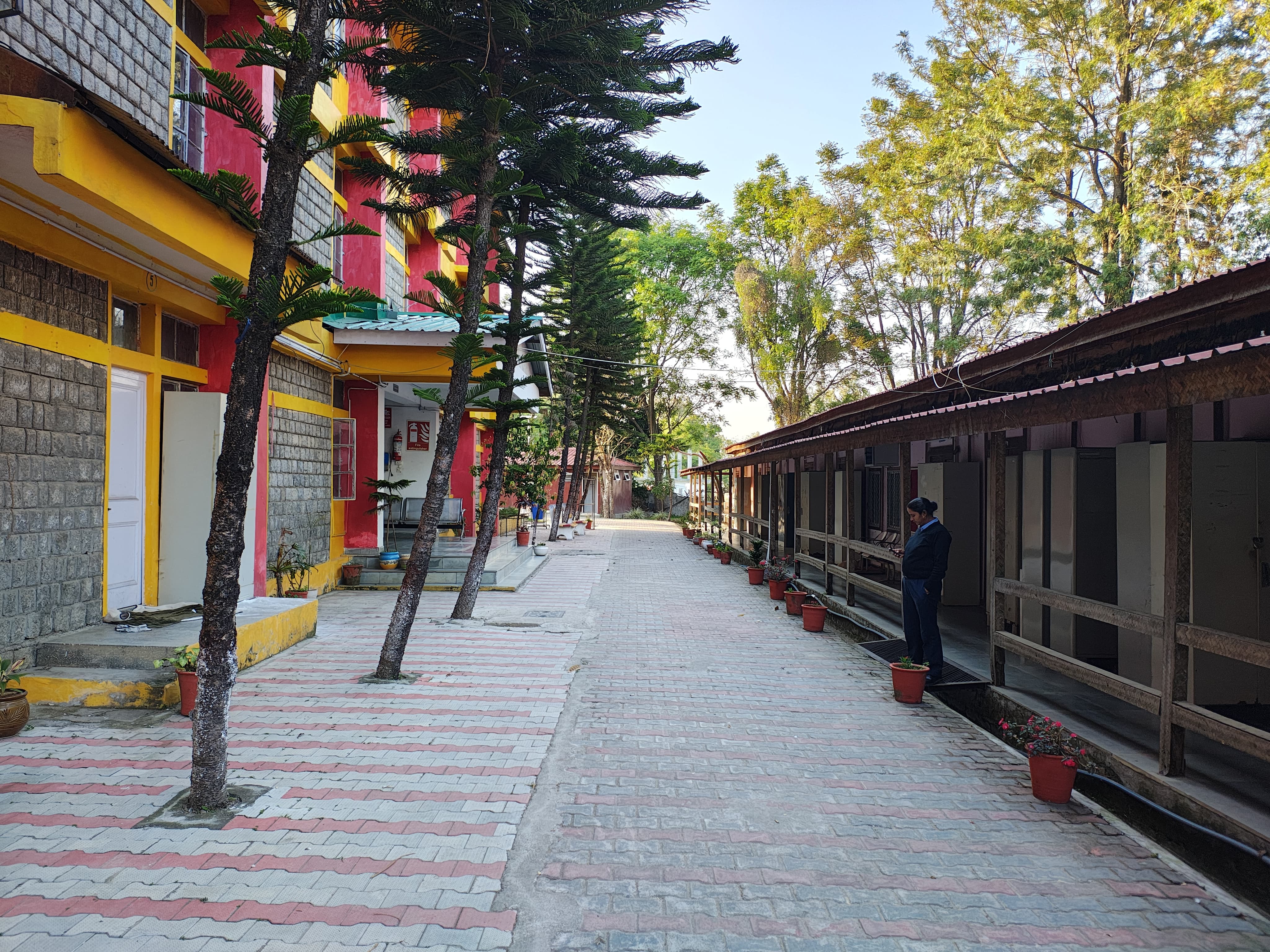
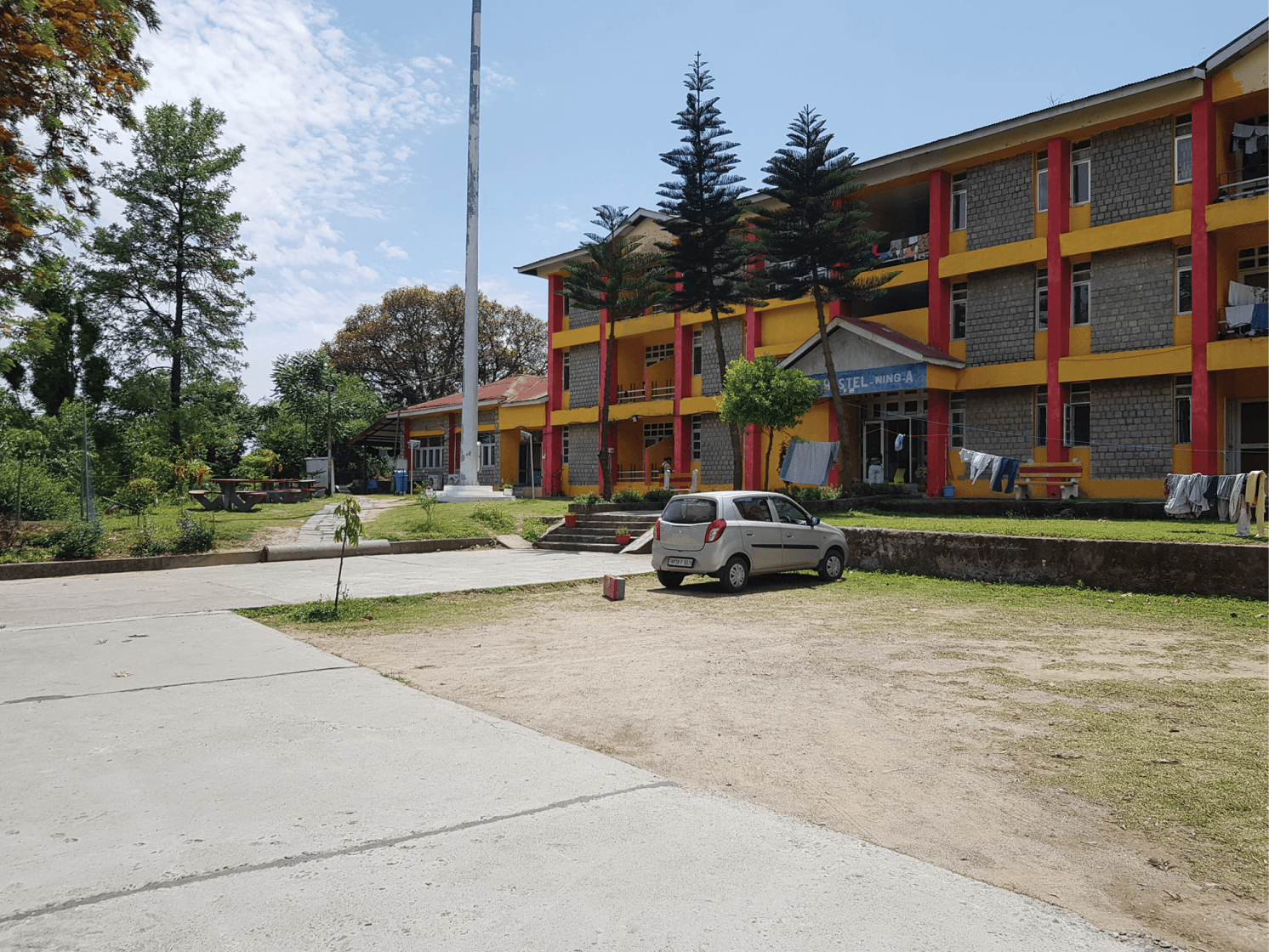
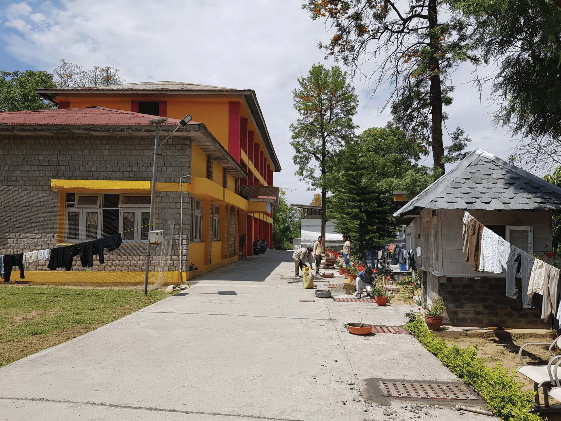
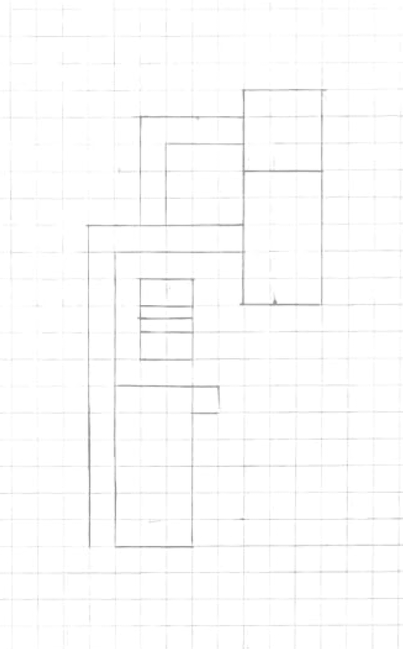
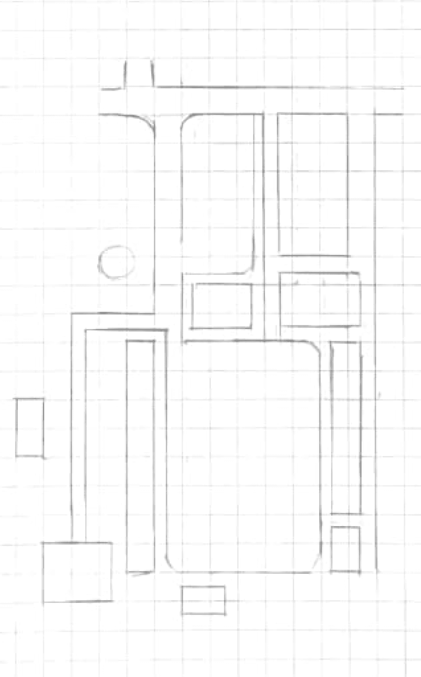
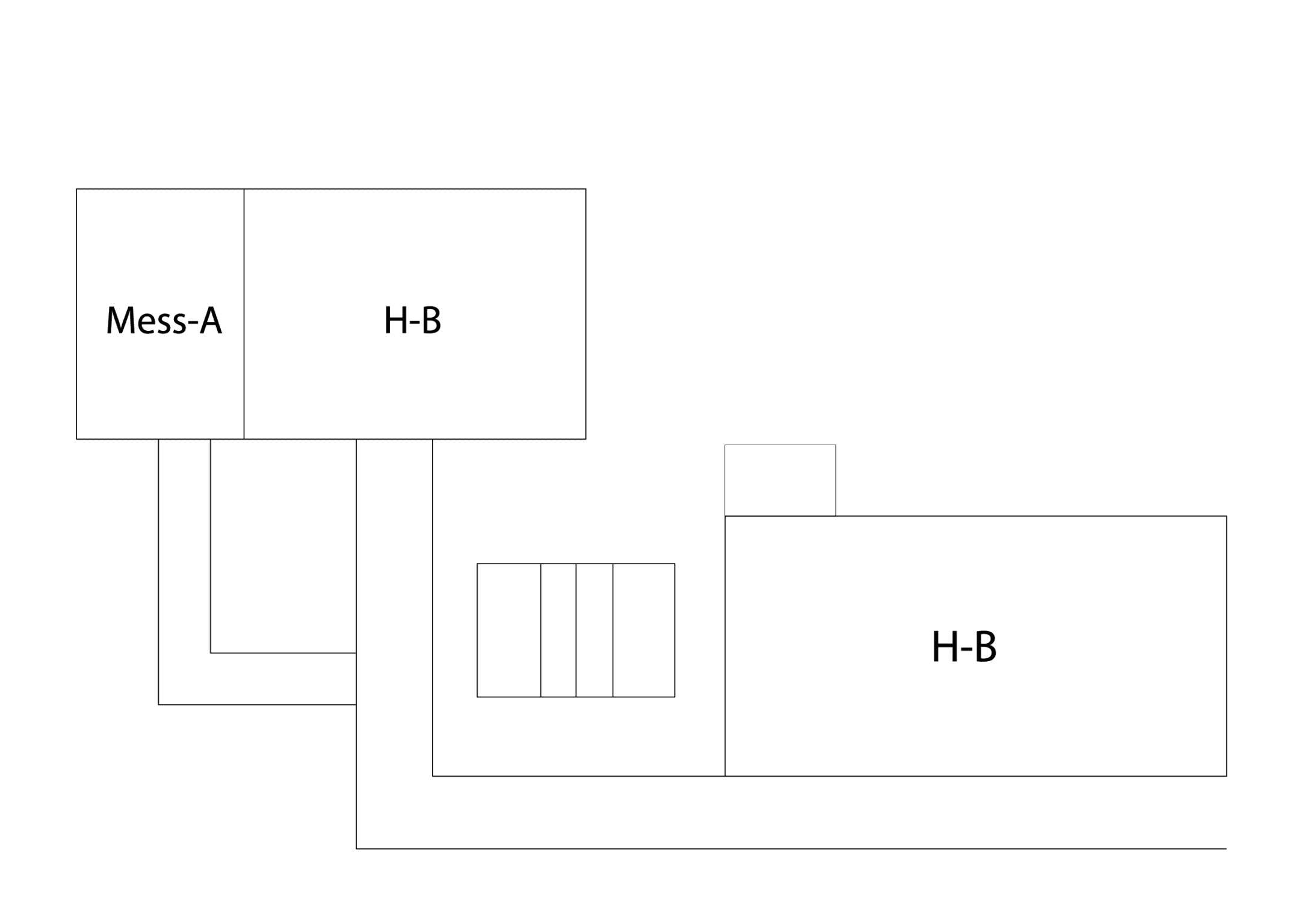
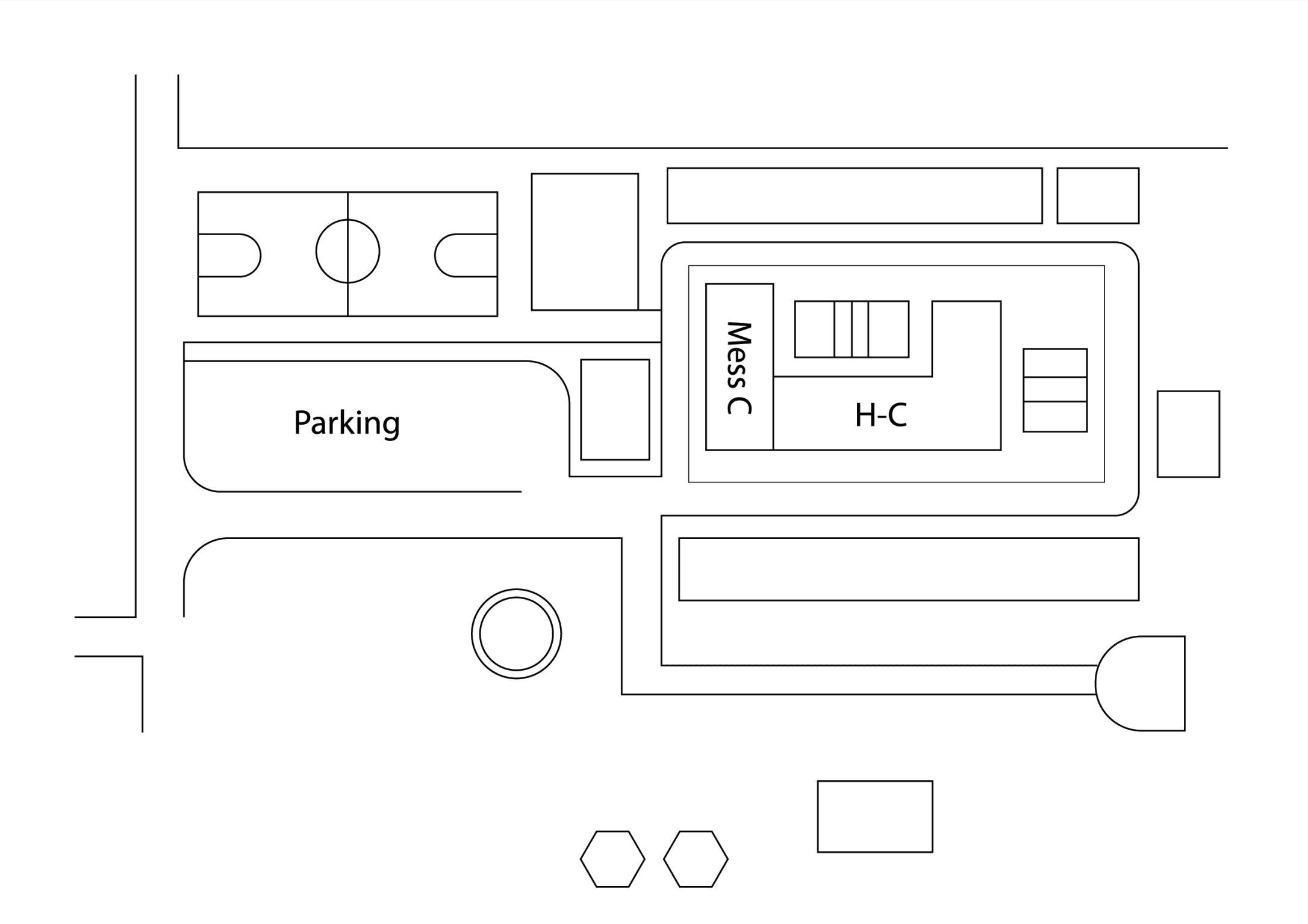
Fig. 10. Sketch of Zone 3 part 1 on grids.
Fig. 11. Sketch of Zone 3 part 2 on grids.
Fig. 12. Digital illustration of Zone 3 part 1.
Fig. 13. Digital illustration of Zone 3 part 2.
Fig. 9. Photographs of Zone 3 sections for analysis and illustration.
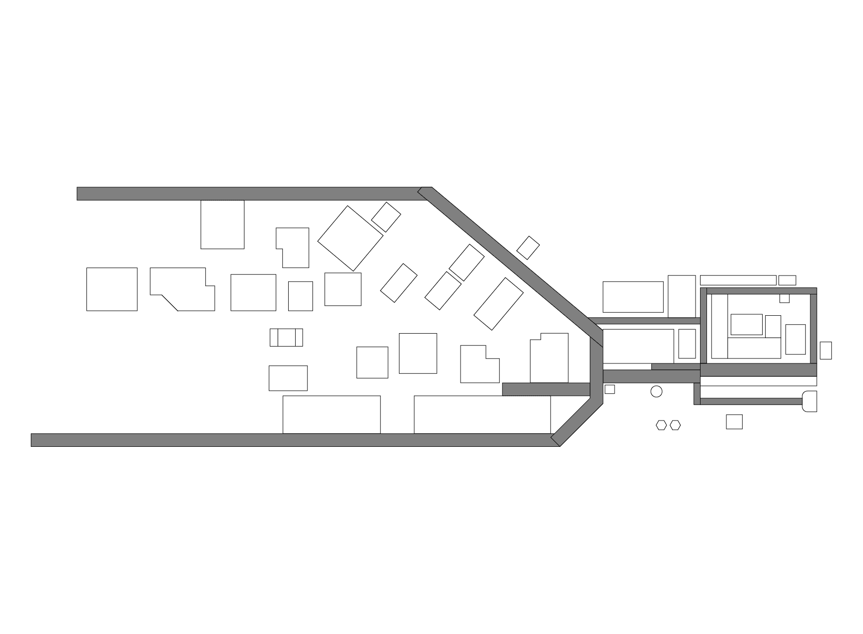
Assembling the Zones together
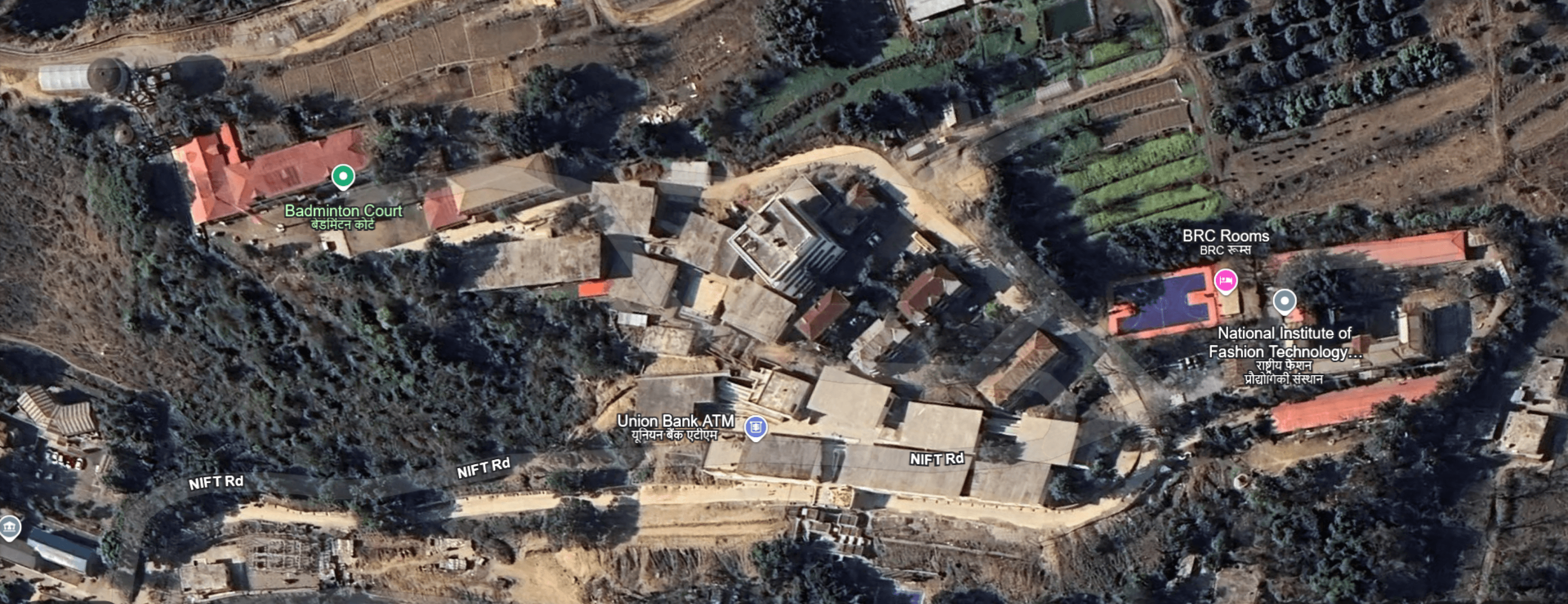
View of NIFT Kangra from Google Earth
Simple is good!
Transforming Sketch into Structure
Mapping the Terrain: Topography
Choosing the right colour
Final colour palette
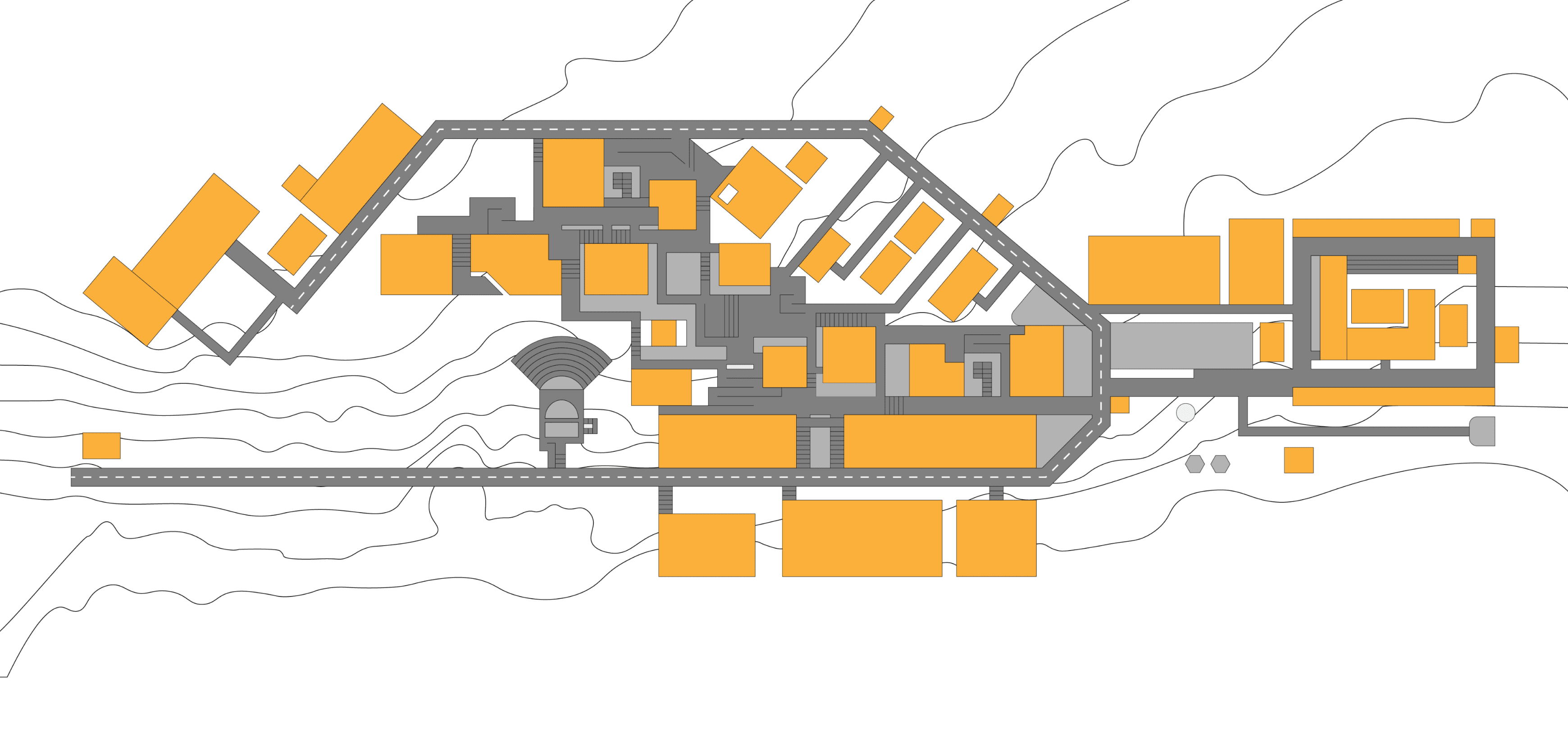
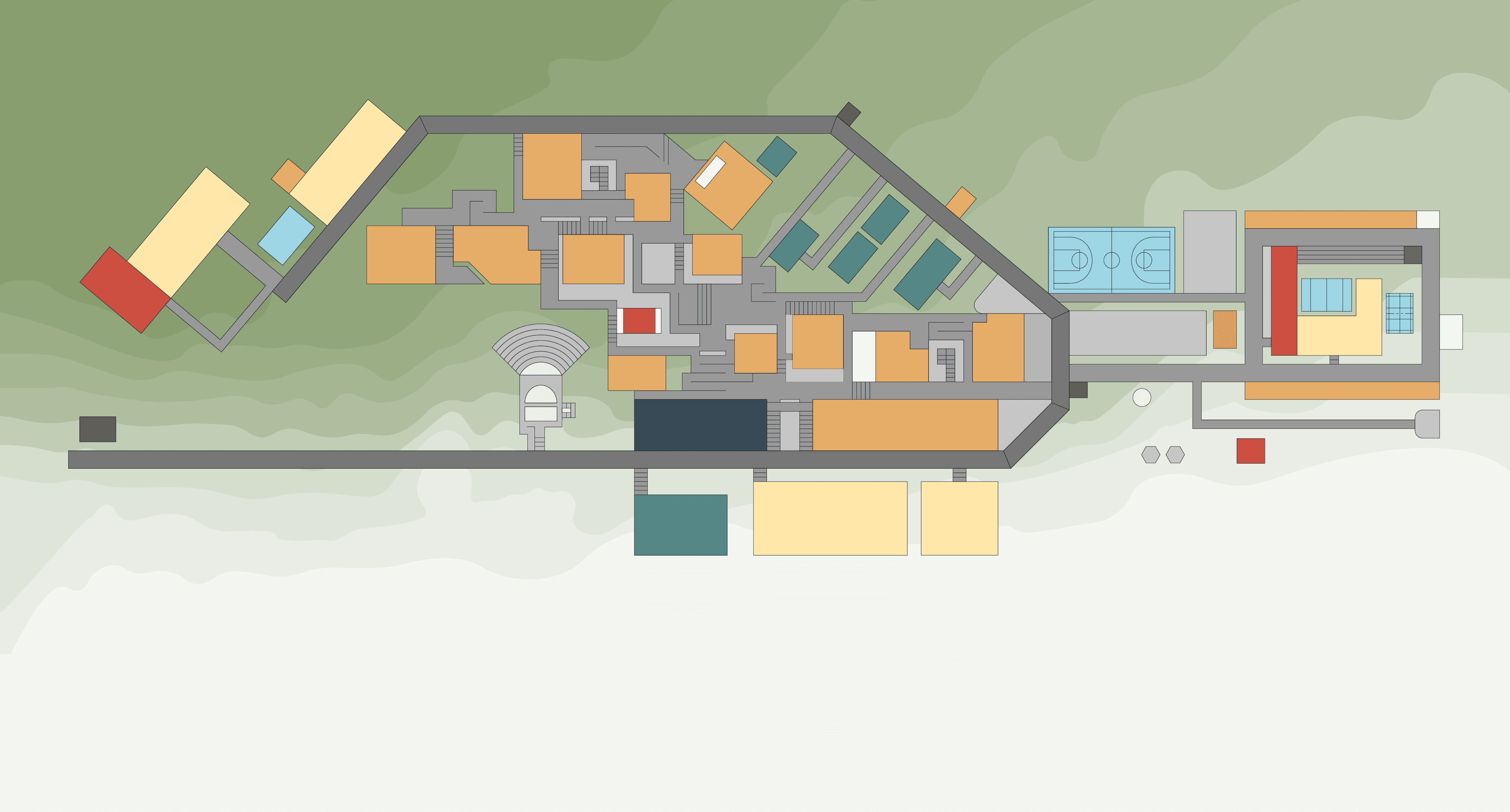
All the areas were then digitally combined to assess the overall structure of the map after simplification, ensuring a clear and accurate representation of the campus layout.
A Google Earth image was then used as a reference to understand NIFT Kangra’s actual layout and path structure. This helped in determining that certain paths and buildings needed to be positioned at specific angles to ensure better user relatability
The final sketch of the map was created after thorough observations and feedback from our mentor and faculty and ensuring clarity, and ease of understanding for users.
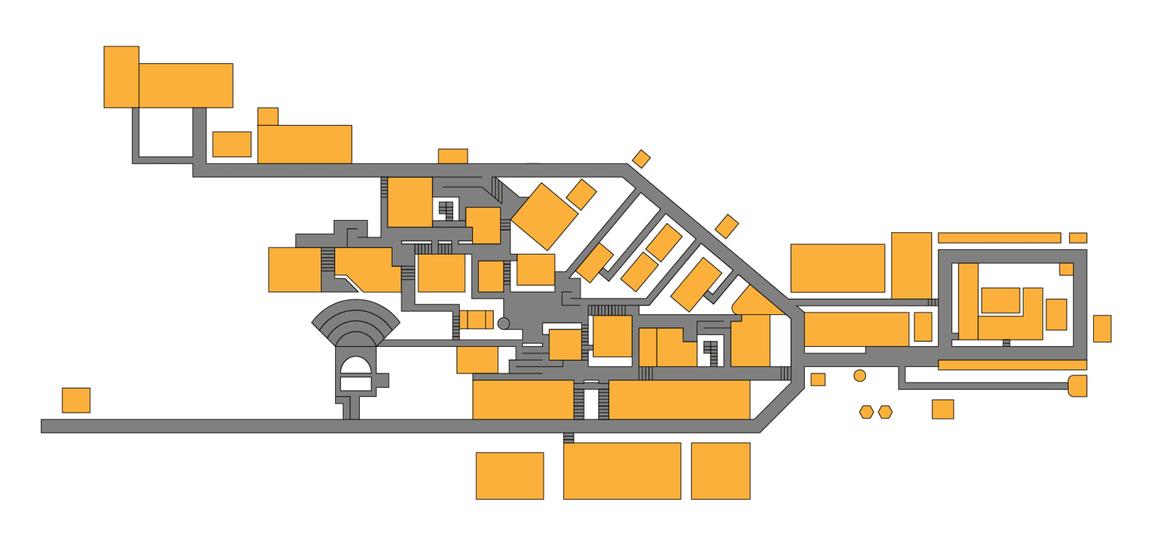
Next, shapes were used to digitalise the map, ensuring consistency in design. Major roads followed a uniform style, paths where vehicles were not allowed had a different style, and narrow pathways within the campus maintained a distinct yet consistent representation.
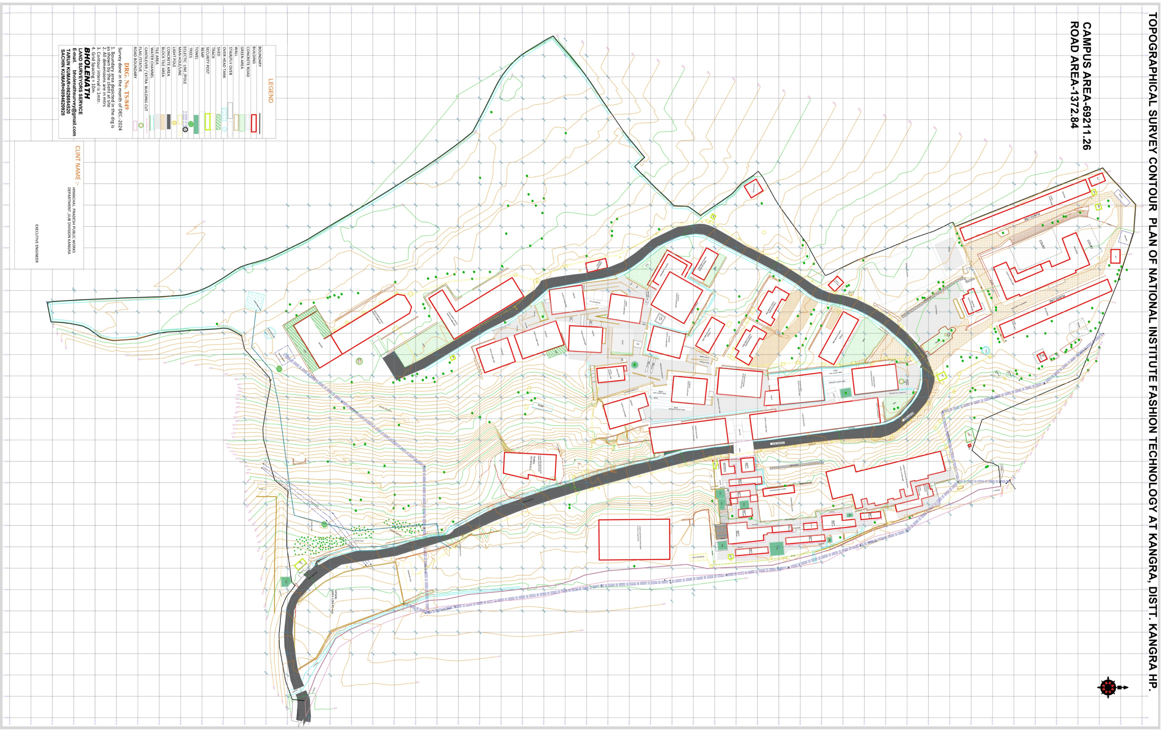
The map features traced topography from the actual terrain, ensuring spatial accuracy.
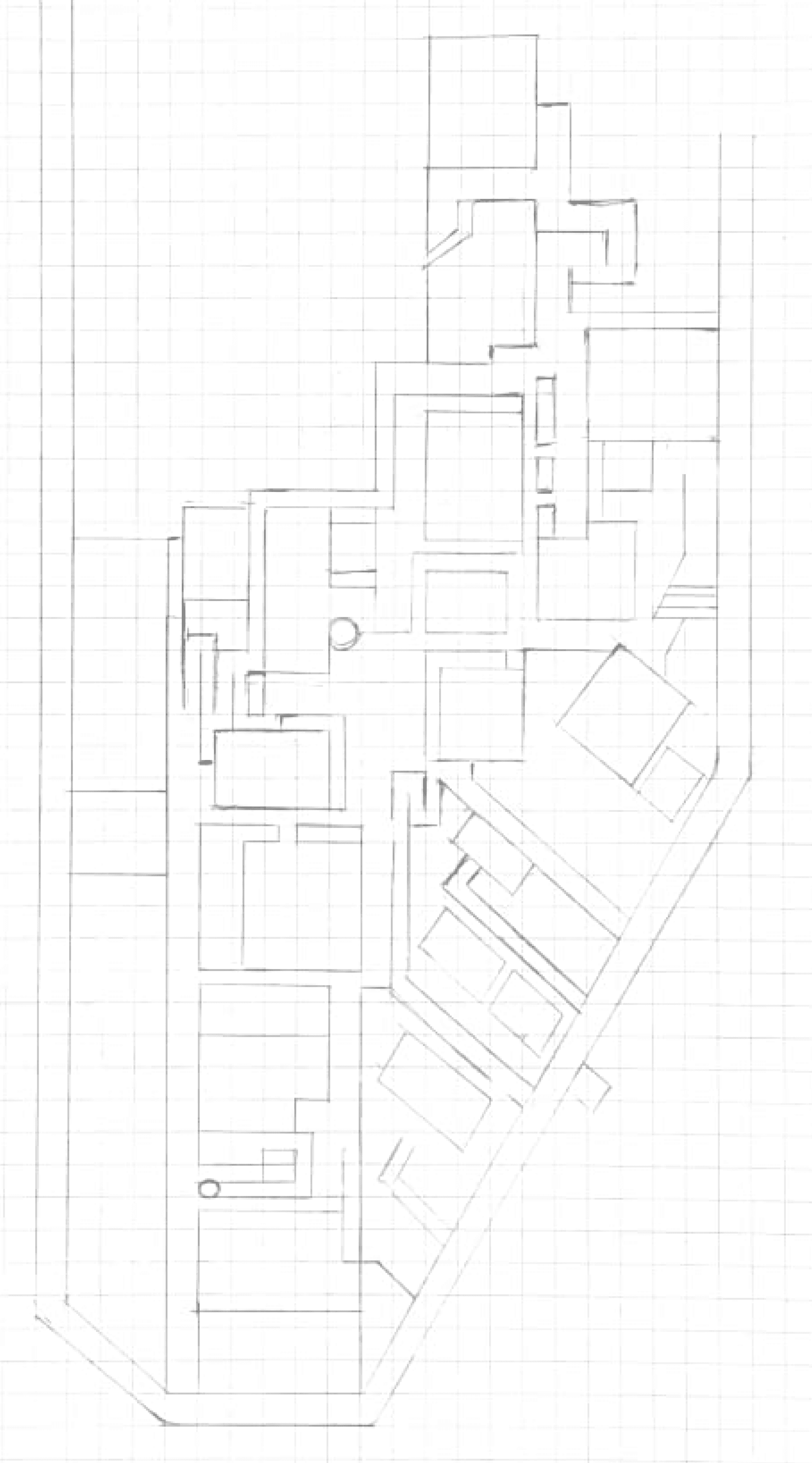
Drafted hand-drawn layouts to capture spatial relationships. Then Digitalize it
Muted Pastels: The first approach used soft pastel colours, but they appeared dull and lacked contrast, making differentiation between zones difficult.
Final Iteration: The last approach balanced high differentiation, aesthetic appeal, and print feasibility, ensuring readability while maintaining a visually engaging design.
Deepened Colour Palette: We then tried adding more depth to the existing colours, although it did look better but there was still something missing.
Disability-Inclusive Colours: A colour-blind-friendly palette was tested, ensuring accessibility. However, it lacked visual cohesion for print.
Instead, we plan to integrate this into a future digital version, accessible via a QR code on the map.
The Andamanese Language Map process: This illustrated the importance of abstraction in navigational aids.
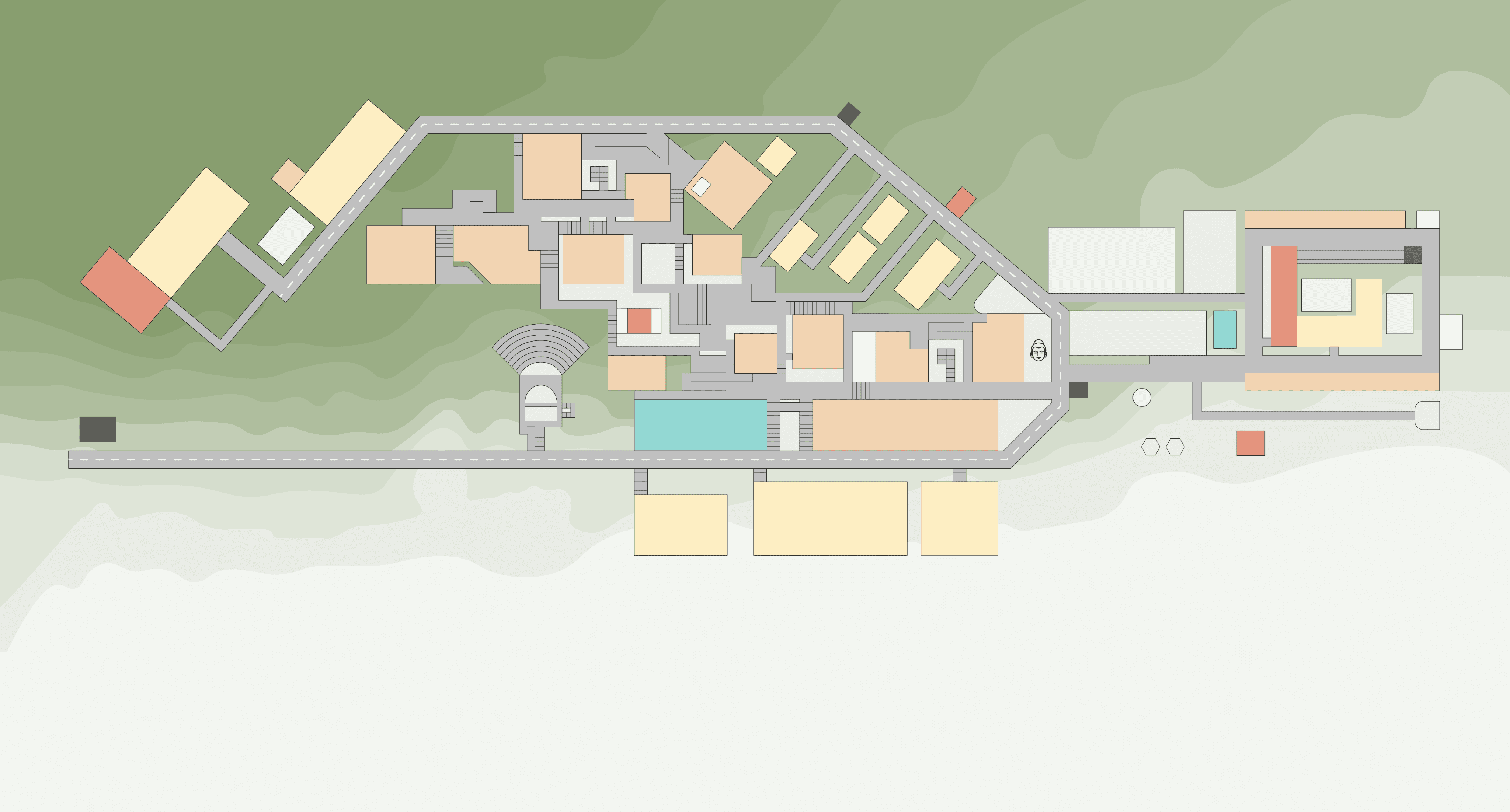
Academic Blocks (#fcb765) – Given the highest visual priority with a warm, inviting shade of muted orange, ensuring immediate recognition and associating with focus and learning.
Administrative Block (#344b5b) – Uses a deep blue-grey tone, reflecting authority, organisation, and density, making it visually prominent yet balanced.
Hostels (#fcdc65) – A soft yet vibrant yellow, making residential areas feel welcoming while remaining visually distinct from academic spaces.
Staff Residences (#558787) – A calm, muted teal, creating a subtle yet distinct differentiation from student hostels.
Canteen (#dd655b) – A deep red tone, chosen to evoke warmth and energy, as dining areas are key social hubs on campus.
Parking Areas (#bfbfbf) – A neutral grey, ensuring the least distraction while remaining legible.
Guard Posts (#5e5f5b) – A subtle, desaturated shade of grey, maintaining a balanced presence without overpowering other zones.
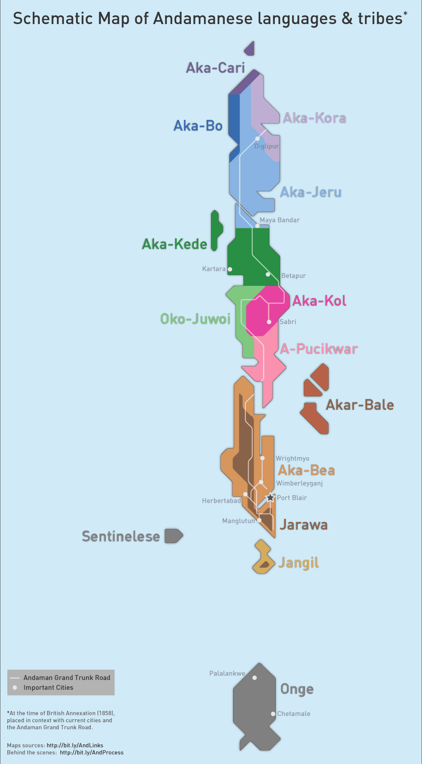
Fig. 14. Inspired by the Andamanese Language Map for simplicity and clarity.
Fig. 15. Converting sketches into digital illustration.
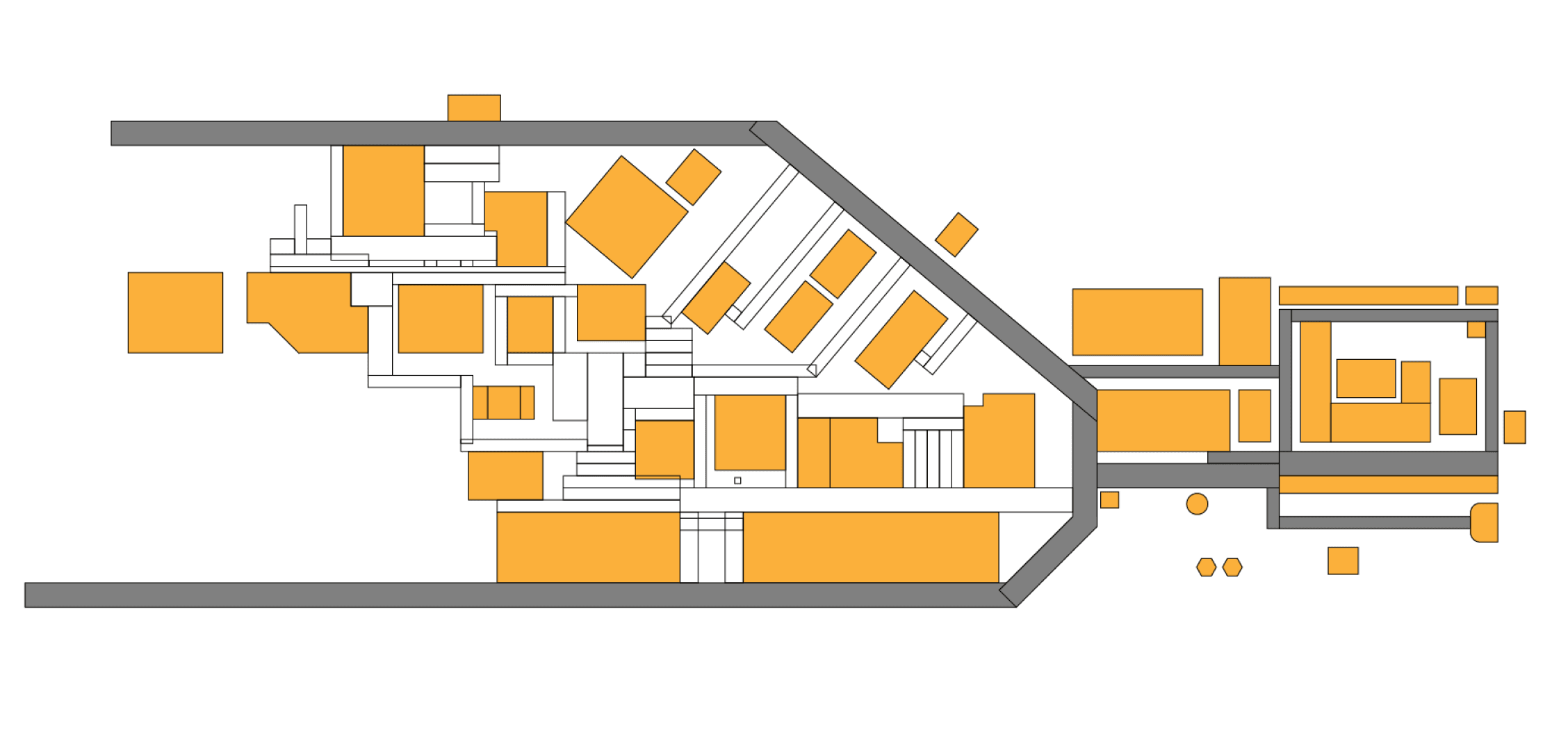
Fig. 16. Adding paths and staircases
Fig. 17. Combining all the zones together.
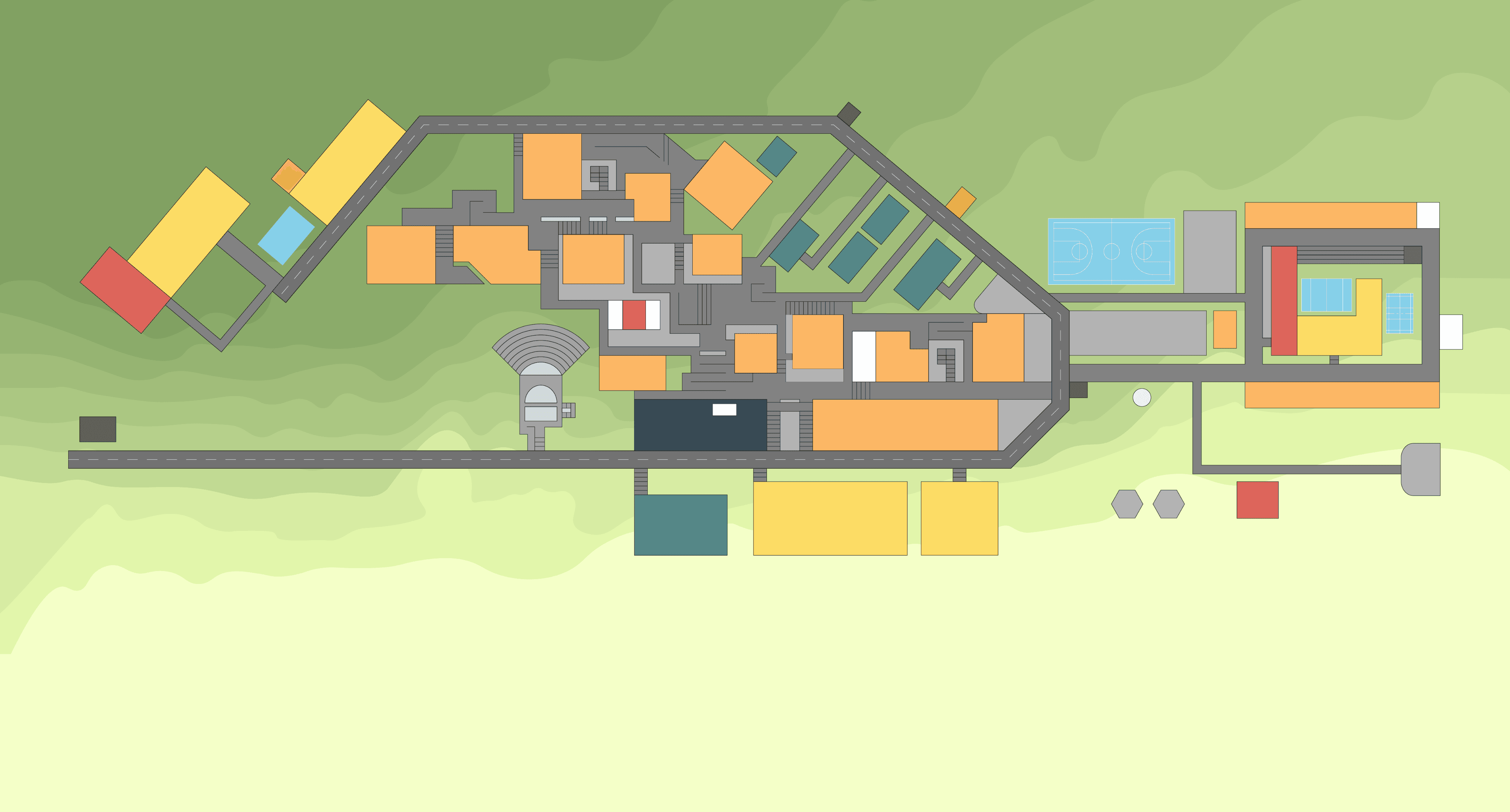
Fig. 19. Incorporating Topography to the map
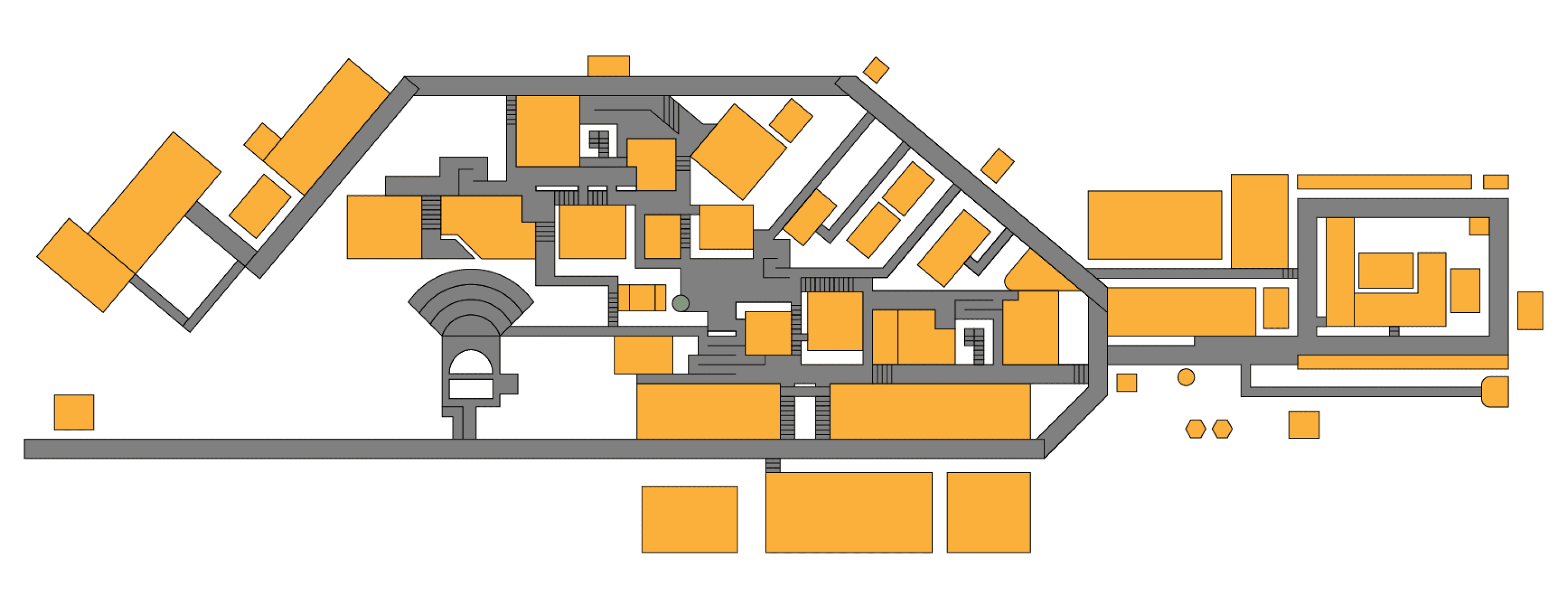
Fig. 18. Tilted Zone 3 Part 1 for design balance, inspired by the London Underground Map.
Final Design Phase 1
Grid System, Legend Placement & Colour Coding
How did we validate our design?
Parallel Prototyping – Developed two different layout versions for comparative analysis.
A/B Testing – Measured user comprehension between different designs.
Information Architecture Structuring – Organised navigation elements hierarchically.
Key Refinements Based on Testing:
Increased font size for better legibility.
Adjusted legend positioning for quick visual access.
Refined river structure and added subtle texture for a more realistic appearance.
Used landmark-based positioning for natural navigation cues.
Future Improvements (Self-Critique & Feedback):
Adding Washrooms to Legend: Clearly marking washroom locations for better user convenience.
Improving Overpowering Textures: Making certain textures like the rocks near the river more natural and subtle to maintain visual harmony.
Aligning Grids with Buildings: Refining grid placements to better align with building structures for improved navigation accuracy.
Marking Entry Points: Adding entry points for each building to enhance accessibility and user clarity.
Thin Diagonal-Lined Texture (Discarded)
Intended to mimic traditional geographical maps and subtly represent grass.
Appeared visually chaotic and overwhelming with the legend and other elements.
Reduced readability and made the overall map harder to interpret.
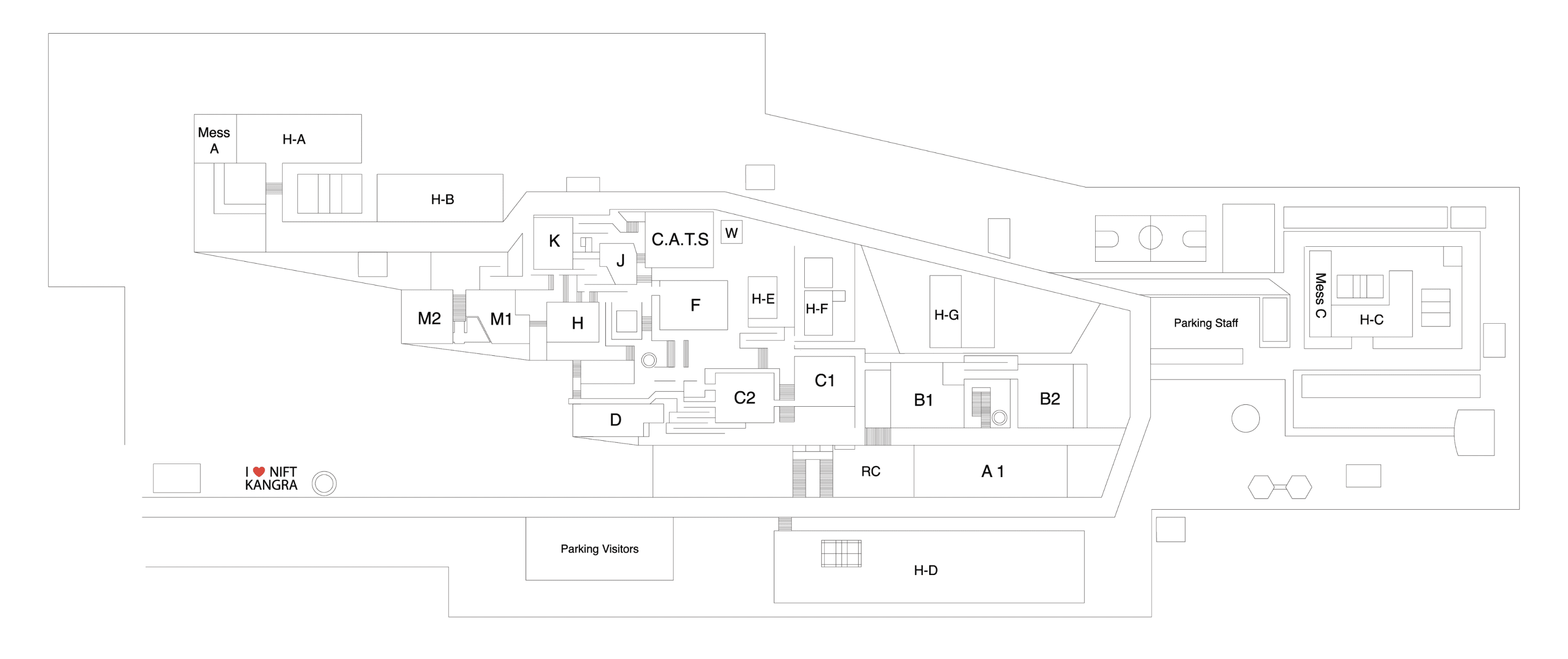
Grid System:
Divides the campus into smaller sections for structured navigation.
Users can cross-reference grid coordinates with the legend for quick location identification.
Reduces guesswork and confusion, making wayfinding more efficient.
Legend Placement:
Positioned for easy accessibility and quick reference.
Lists blocks, facilities, and key locations alphabetically for clarity.
Includes floor indicators with coloured circles to simplify multi-floor navigation.
Colour Coding:
Establishes a clear zoning hierarchy to differentiate key areas.
Coloured indicator circles represent different floors, aiding in multi-floor navigation.
Subtle Grass-Like Texture (Final Choice)
Provided depth and realism without creating visual clutter.
Maintained a clean, balanced look that complemented the zoning colours.
Allowed better contrast and clarity, ensuring seamless navigation.
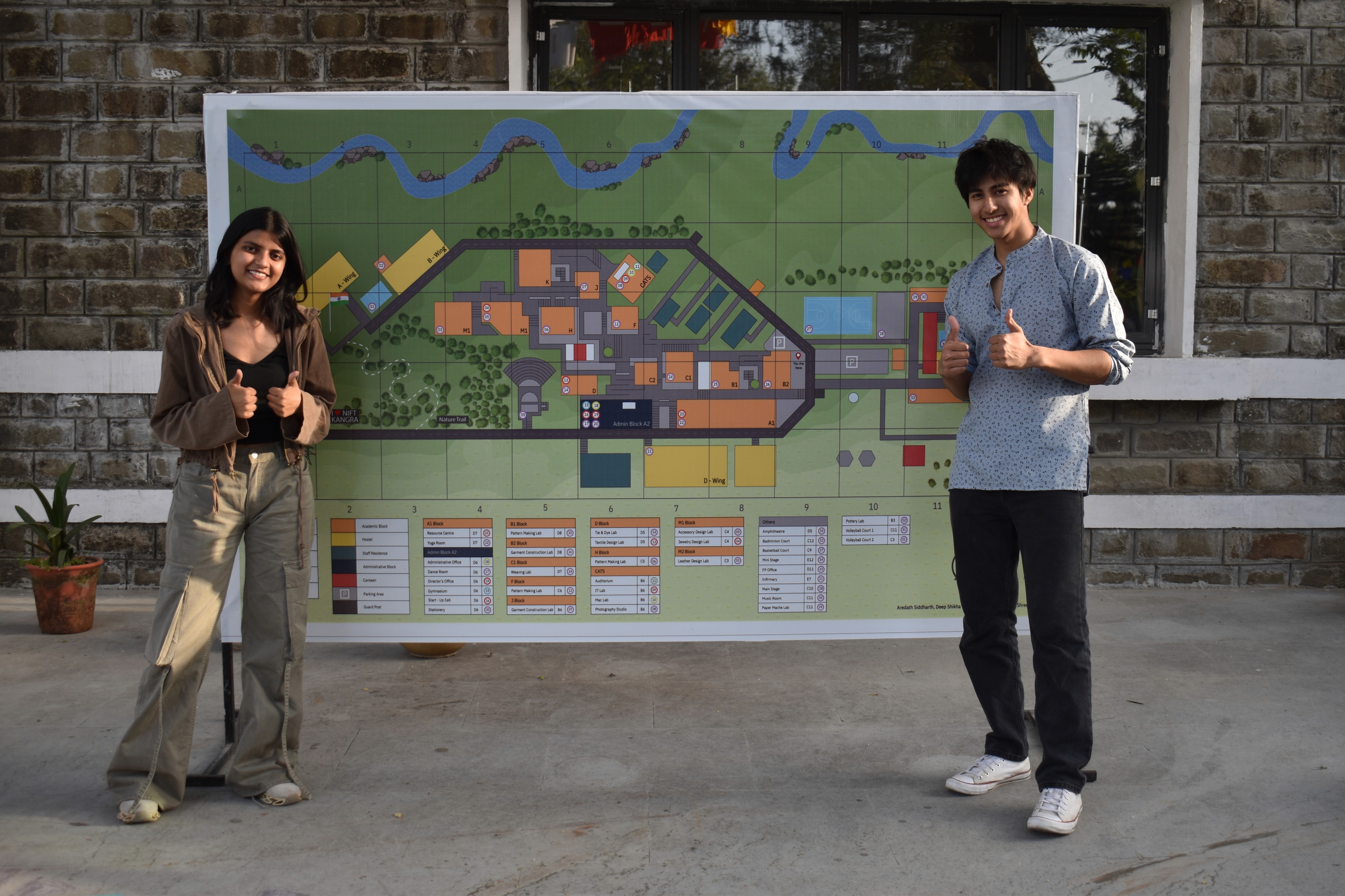
Celebrating Success and Future Plans
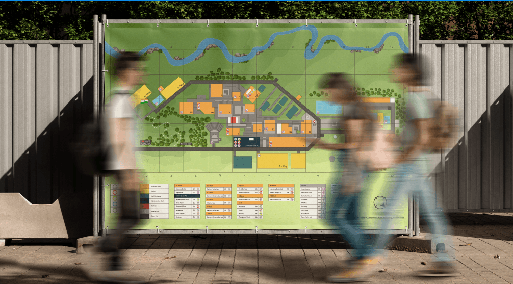
This project marked a significant achievement as the printed test version of the map received overwhelmingly positive feedback for its clarity, aesthetics, and functionality. The successful trial run demonstrated its potential as an effective navigation tool for the campus.
Encouraged by these results, the map is now set to be officially commissioned for large-scale printing on a durable vinyl sheet, serving as the official NIFT Kangra campus map. This milestone reflects our commitment to enhancing user experience through thoughtful design and practical implementation.
PROTOTYPE
Bringing Ideas to Life
Choosing the right texture
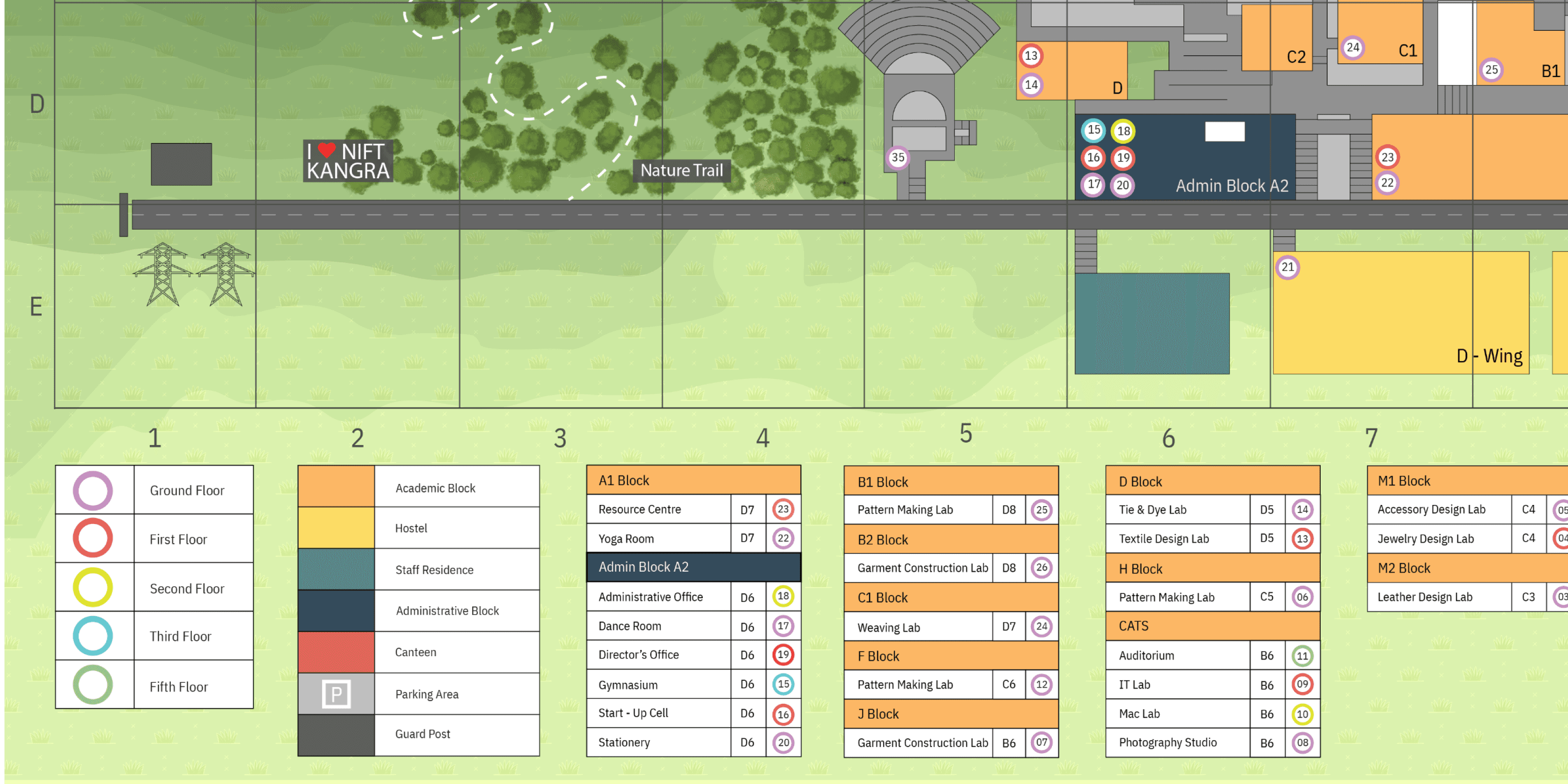
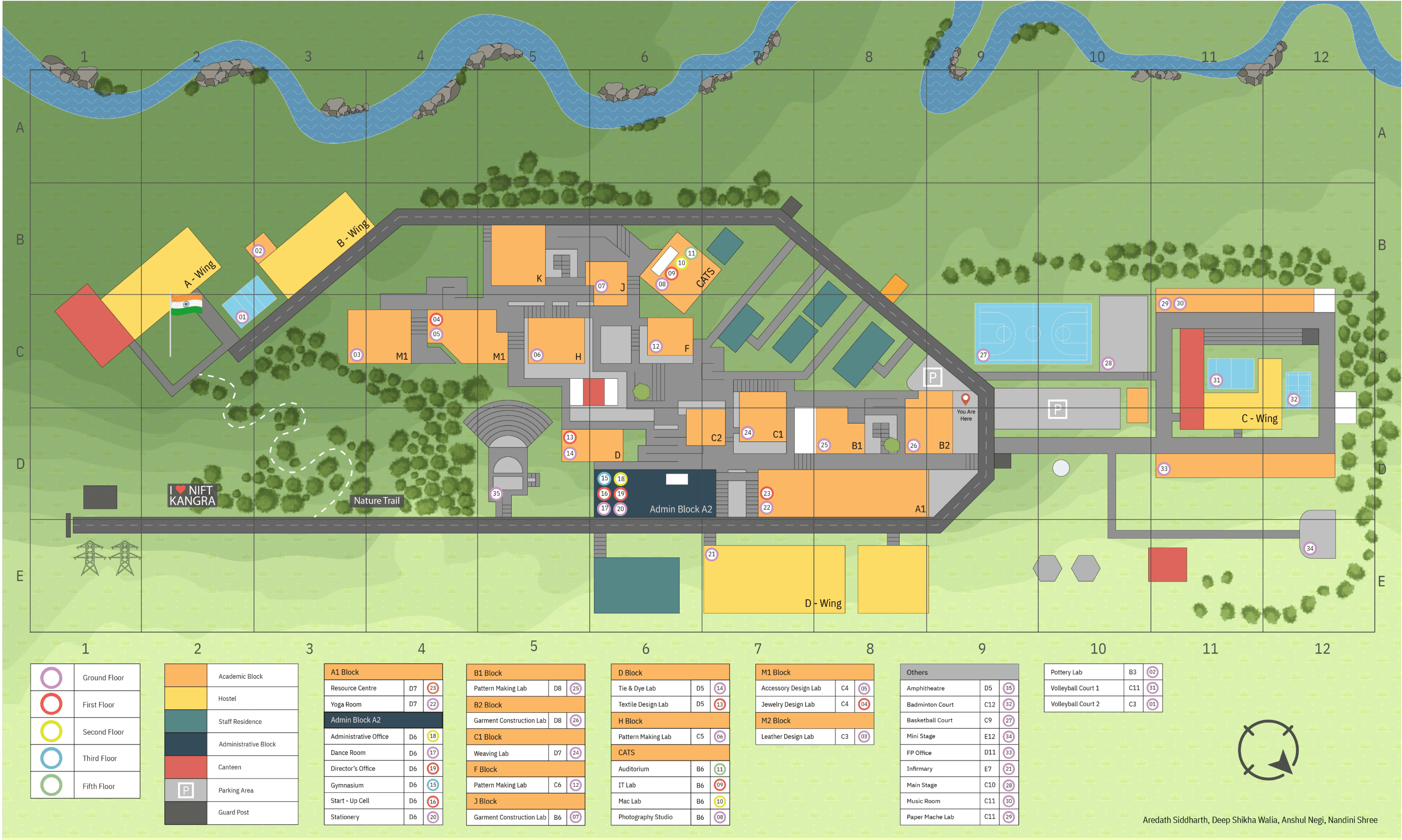
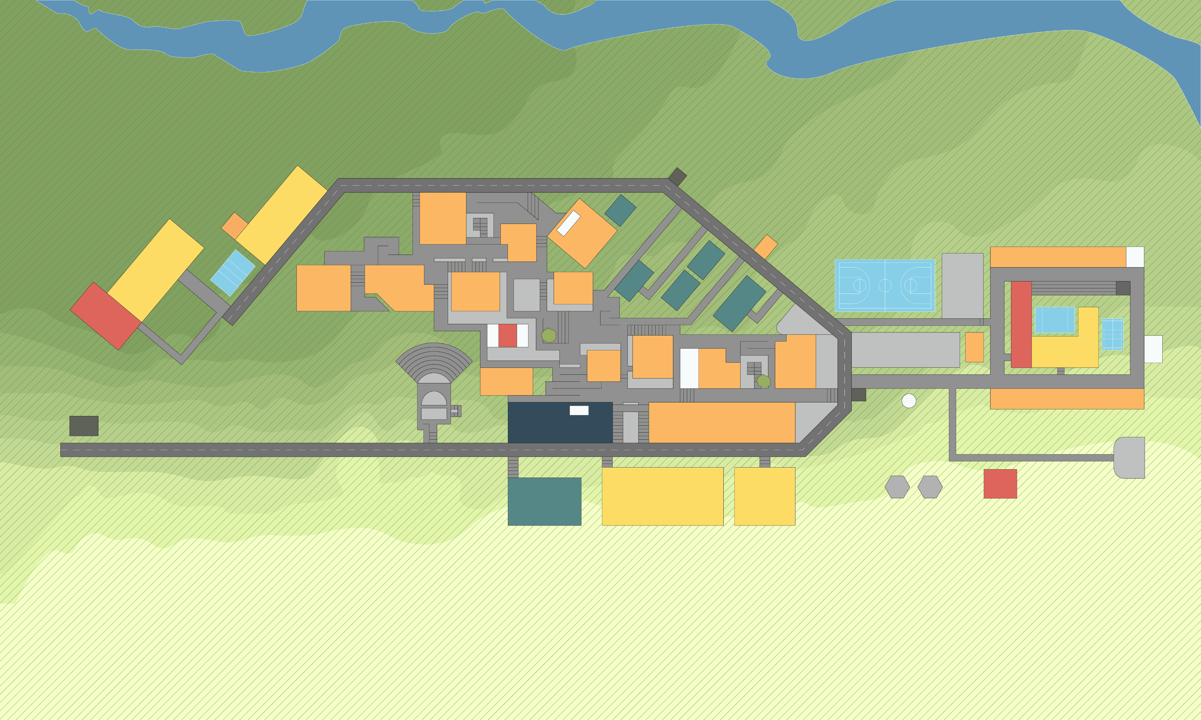


Fig. 20. Adding thin diagonal-lined texture to the map
Fig. 21. Adding subtle grass-like texture to the map
I'm a UI/UX & Graphic Designer blending creativity with functionality to craft sleek, user-friendly experiences. From designing event logos to revamping navigation systems, I turn ideas into visuals that click.
#1
The project aimed to simplify campus navigation for new users and visitors. This was achieved by developing a visually intuitive map with a clear hierarchy, streamlined layout, and enhanced readability, ensuring effortless wayfinding and user accessibility.
UX Case Study
The project aimed to simplify campus navigation for new users and visitors. This was achieved by developing a visually intuitive map with a clear hierarchy, streamlined layout, and enhanced readability, ensuring effortless wayfinding and user accessibility.
UX Case Study
NIFT Kangra Campus Map Design


NANDINI SHREE
IDEATE
How might we solve this problem?
Based on our research, we began structuring the map using various design methodologies, which are as follows:
Mental Map
The first step before creating the initial map was developing a mental map of NIFT Kangra. This helped in understanding the campus layout based on familiarity, key landmarks, and navigation patterns, providing a foundation for shaping the final map.
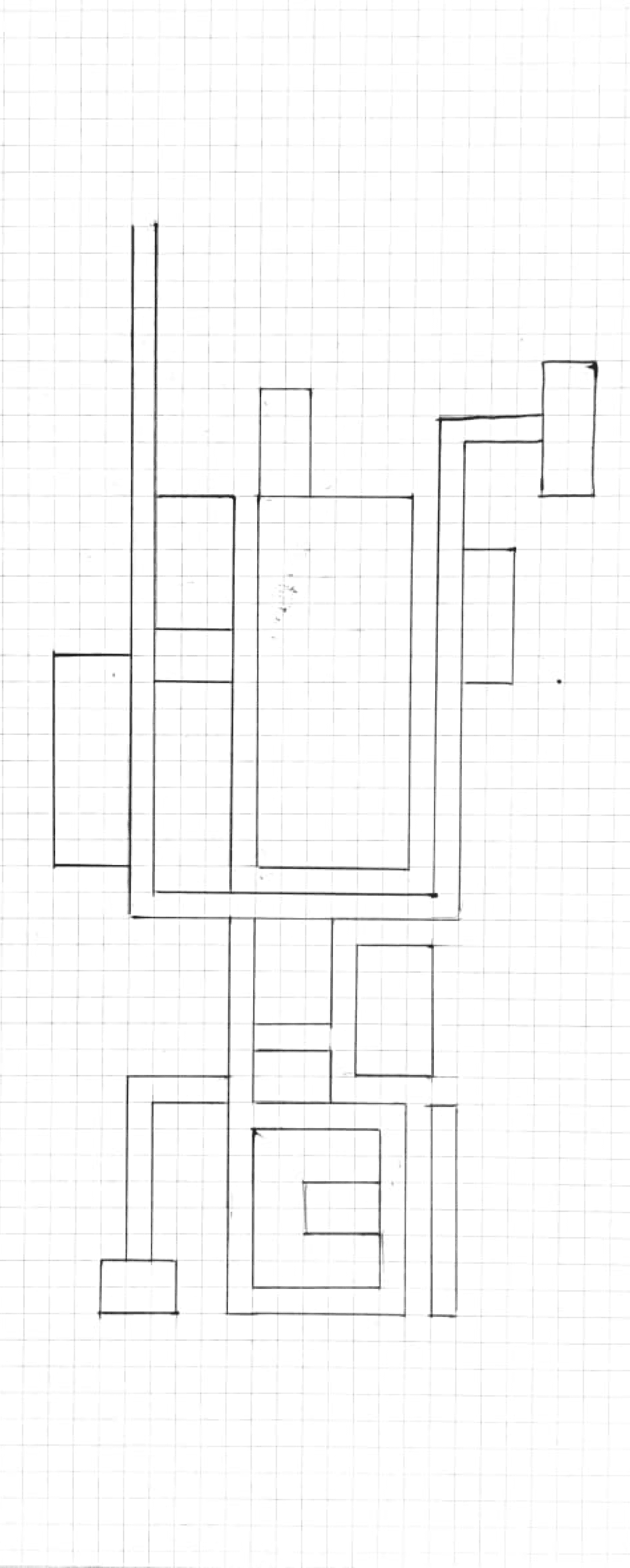
Fig. 2. Sketch of the mental map of the college campus on grids.