Never have a bad meal

What’s the mission?
What’s the catch?
So, what’s the plan?
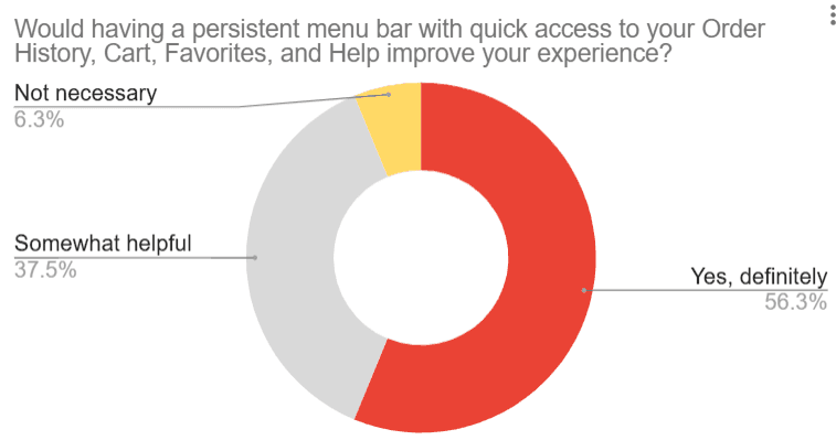
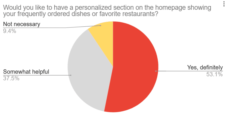
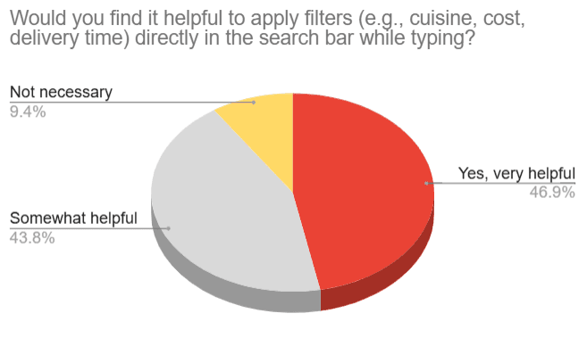
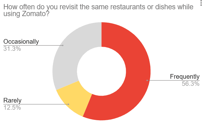
Users want speed, clarity, and better accessibility in Zomato’s interface. Around 60% demand a sticky menu bar for seamless navigation, while 60% struggle to switch between sections. 50% find search filters limiting, especially for dietary preferences, and 65% miss out on deals due to scattered coupons and refunds. Half of the users want a one-tap reorder for faster repurchases.
The message is clear—Zomato needs a smarter, smoother, and more intuitive experience!
Founded in 2008 by Deepinder Goyal and Pankaj Chaddah, Zomato is a top-tier food delivery and restaurant discovery platform. From browsing menus and reading reviews to ordering food and tracking deliveries, it’s got everything covered. Competing with Swiggy and Uber Eats, Zomato spices things up with AI-driven recommendations, real-time tracking, and easy digital payments.
With a strong foothold in India and beyond, it’s constantly innovating to keep up with ever-changing customer cravings. But, like every good recipe, it’s not perfect—users have flagged hiccups with navigation, search filters, and checkout processes, making the ordering experience feel less than seamless.
To untangle Zomato’s user experience!
The goal?
Spot what’s tripping users up and redesign the flow to make everything feel natural, smooth, and frustration-free.
Users want speed and convenience.
But Zomato’s interface?
Not always on the same page. With hidden features, scattered options, and confusing navigation, the experience was ripe for a makeover.
Dive into Zomato’s existing IA and UX, uncover pain points, and build a smarter, cleaner, and more delightful experience.
But here’s the twist—I’ll walk you through the detective work first before revealing the revamped design!
About Zomato
User Research
Process
User Research
Conducted primary research through Google Form surveys, user interviews, and usability testing, and secondary research through competitor analysis to identify pain points.
Proposed Solutions and UI/UX Enhancements
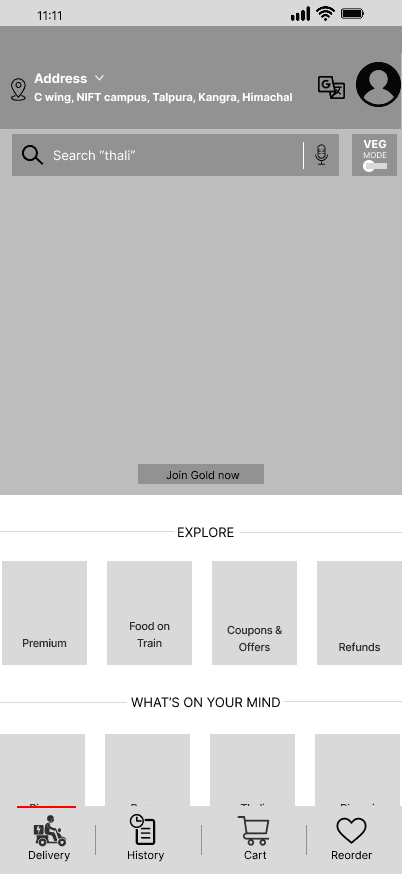
Added sticky navigation, quick reorder, coupons & refunds card, and dietary filters.
?
Usability Issues
Mapped out key user struggles such as inconsistent navigation, lack of cart access, poor reorder functionality, and missing dietary filters, defining the scope of the redesign.
Wireframing and Prototyping
Created mid-fidelity wireframes incorporating the proposed UI changes to demonstrate a seamless and intuitive user flow.
User Personas
Developed two user personas based on research.
Primary Research
Google Form Survey Results
User Interviews
Competitive Analysis
Features
Navigation &
Usability
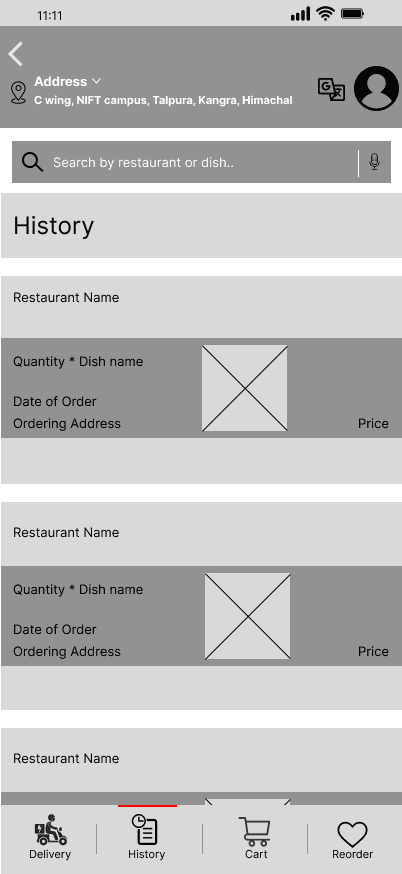
Reorder
Option
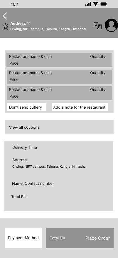
Cart
Access
Search &
Filters
Offers &
Refunds
Persistent button
navigation
Visible on
home screen
Always
Visible
Includes dietary
& healthy options
Organized under
“Savings”
Disappearing menu
extra steps
Hidden under
“Order History”
Only available
at checkout
Basic filters
(cusine rating)
Scattered under
multiple menus
Seamless bottom
navigation in Uber app
Accessible via
account page
Persistent cart
icon
Detailed filters (distance,
delivery time, dietary)
Visible under the
cart
Swiggy
Zomato
Uber Eats
Feedback was gathered from frequent users through interviews, with a specific focus on their ordering habits, the challenges they faced in accessing offers and refunds, and any frustrations encountered during the search process.

To validate my research, I conducted a hands-on user experience test of the Zomato app, simulating typical user journeys.
No Reorder and
Cart option
No persistent
sticky navigation
Limited filtering and
sorting option
Usability Testing
User
Personas
Proposed Solutions
Palak Sinha, 20
Piyush Deep, 30
Archetype
Budget Conscious Student
Female
Kangra Himachal Pradesh
Design Student
Moderate
Gender
Location
Occupation
Tech Savvy Level
Archetype
Routine Oriented Professional
Male
New Delhi
Engineer
High
Gender
Location
Occupation
Tech Savvy Level


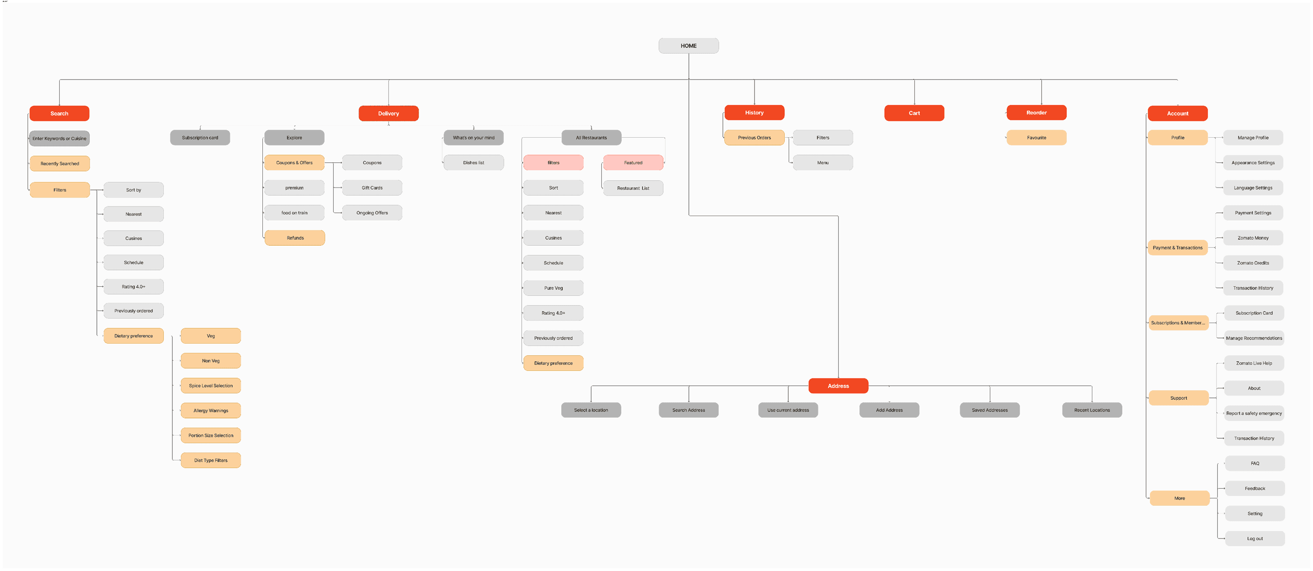
Existing sitemap
New sitemap
Mid Fidelity Wireframes
It had quite a few hiccups!
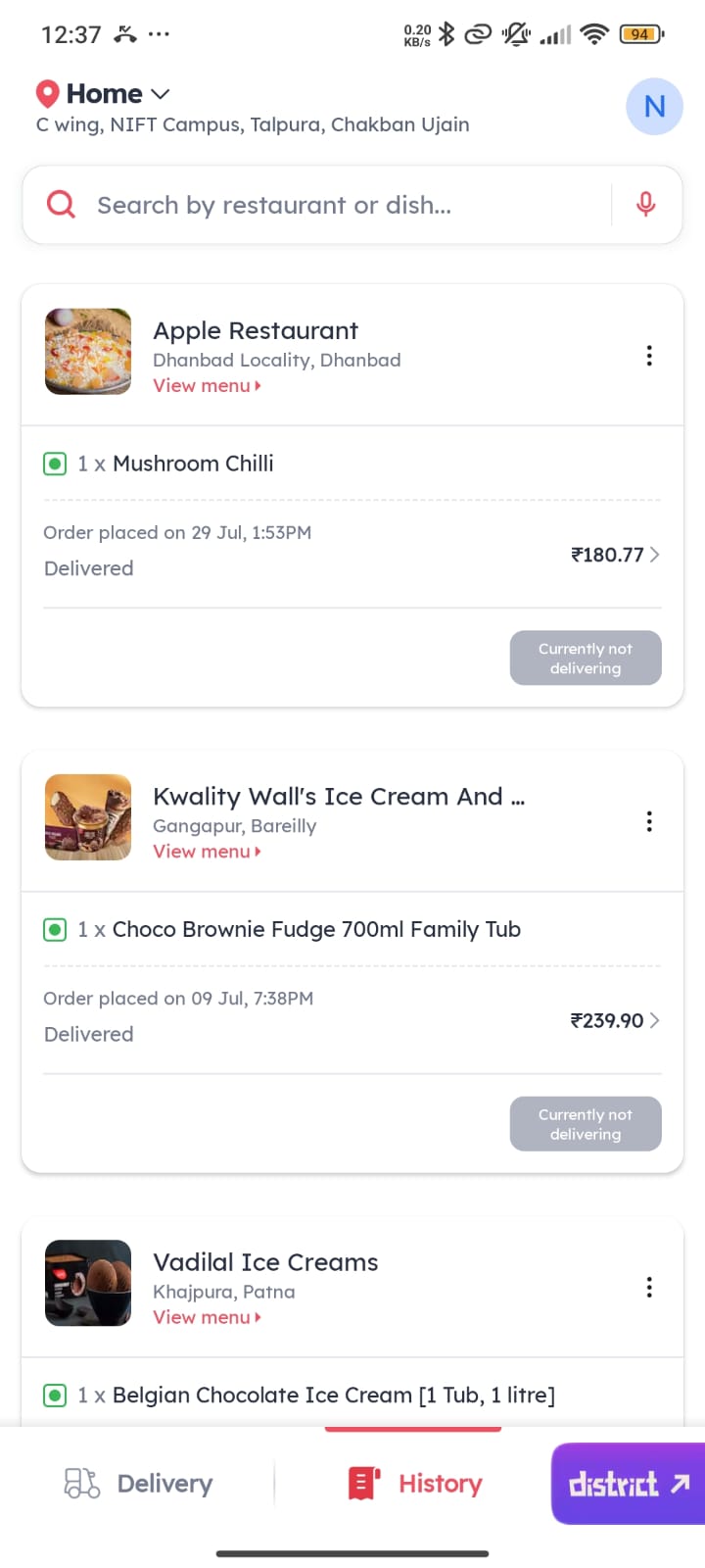
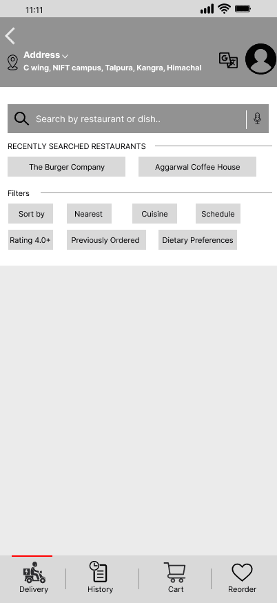
Reordering? Tucked away under ‘Order History’—hard to find.
Cart access? Only available during checkout, disrupting browsing.
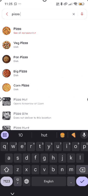
Filters? Too basic—no dietary or delivery time options.
Coupons & refunds? Scattered, making issue resolution tricky.
Profile & settings? Buried under multiple layers.
Incorporated a bunch of smart tweaks, like—
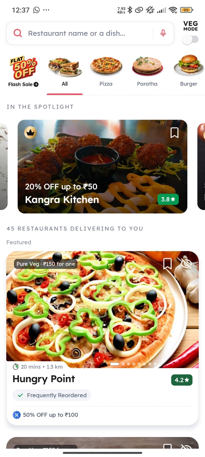
‘Quick Reorder’ is now available right on the home and orders page for instant repeat orders.
A persistent cart icon allows modifications anytime without disrupting browsing.
Advanced search filters offer better personalization—whether it’s dietary needs or delivery times.
A dedicated ‘Offers & Refunds’ section makes savings and issue resolution hassle-free.
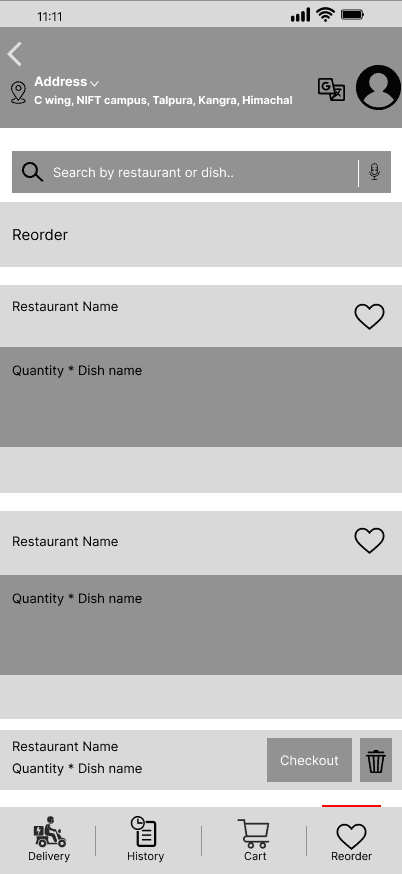
One-tap Reorder button on Home or Delivery Page for quick repurchase.
Mid Fidelity Prototype
Secondary Research
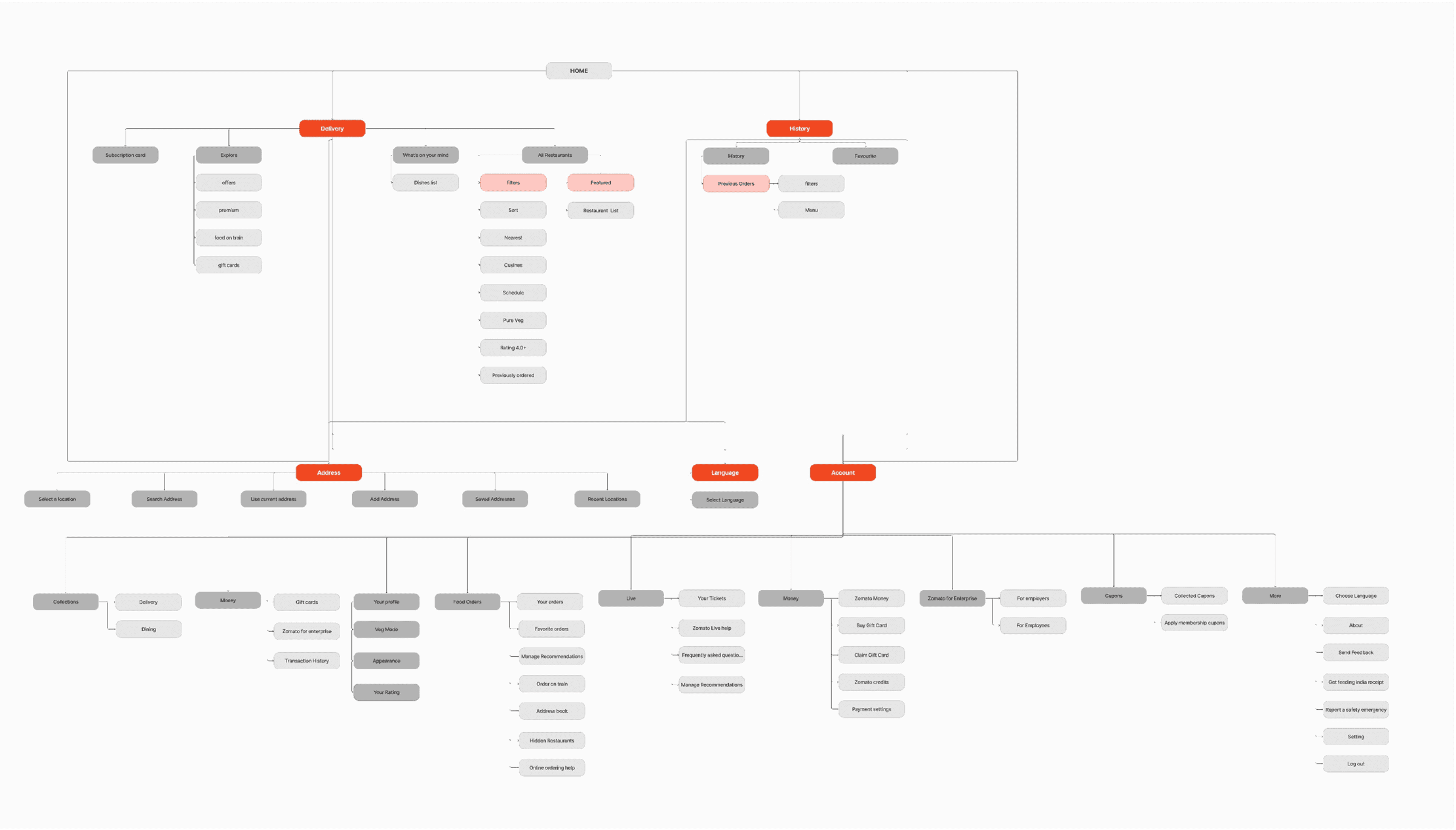
Sticky bottom navigation bar for easy access to Delivery, Cart, History, Reorder.
Introduce advanced filters within the search bar itself, such as cuisine, price, dietary preferences, delivery time, and restaurant ratings, enabling users to find their desired options more effectively
A mid-fidelity prototype has been created with several interactive elements to demonstrate the key UI/UX improvements made to the Zomato application.
Click - Prototype
Clearly categorized Offers & Coupons section, separated from refunds for clarity.
Added a back button better seamless navigation.
Different section dedicated only to History
New section introduced for Reorder.


I'm a UI/UX & Graphic Designer blending creativity with functionality to craft sleek, user-friendly experiences. From designing event logos to revamping navigation systems, I turn ideas into visuals that click.
Improving Zomato’s user experience through enhanced navigation, search systems, and overall usability with a focus on intuitive information architecture.
#2
UI/UX Case Study
Zomato

Improving Zomato’s user experience through enhanced navigation, search systems, and overall usability with a focus on intuitive information architecture.
#2
UI/UX Case Study
Zomato


NANDINI SHREE